

My first design project ever (est. 2017):
Build a project management app called
Taskly
Taskly is a project management app designed with the everyday user in mind. The project management app market is overflowing with options making it difficult to penetrate, but not impossible. Taskly's features address the market need for an app that works for a student and business person alike by embracing the value of quick, practical and simple interactions while upholding the visual experience for all users.

End-to-end design process took place between Jan 2017 - Feb 2018. The app was designed as part of the UX Design program at the CareerFoundry.
Tools

Approach
Overview
Techniques & Methodology
Understanding the Market & the User
To start the design process, I first needed to get a comprehensive understanding of the target market as well as individual needs to define the next course of action for actually building the app.
Market Research
Competitive Analysis
User Interviews
User Personas
Building the Information Architecture
Using my background in decision-making psychology and UX discovery methods, such as user-testing the product at it’s early stages, I was able to get in the mind of Taskly’s potential users, how they would interact with the app, what would make sense and what would not. This understanding would help me shape the app’s structure, flow and order of presenting information.
User Testing
Task Models
Paper Prototypes
Card Sorting Exercises
Wireframes, Prototypes & Mockups
Once I identified what was missing in the project management app market, who the Taskly users would be and how they would use the app, it was time to start the digital designs. First, I created lo-fi wireframes and iterated on them by conducting more user-testing sessions. Then, by using color theory and through brand research I was able to finalize Taskly’s feel and identity and it was time to create hi-fidelity wireframes to deliver a pixel perfect product.
Lo-fi Wireframes
Hi-fidelity Wireframes
Mood Board, Style Tile and UI Kit
Mockups
Competitor Analysis
Taskly is in the task/project management app/software market. To understand this market, I analyzed three of it’s potential competitors: Apple Reminders, Swipes and Zapty.
See the links at the bottom of the page for a more comprehensive comparison of the three products.
It is clear that people are always looking for a better way to keep track of lists, to-do’s, reminders etc.
By combining the stronger features of the three competitors above, Taskly can provide a well-rounded experience for the everyday user, ranging from someone looking for a convenient place to keep a list to a person in search of a more robust task management system to keep their project on track.

User Personas
Personas are a valuable part of a goal-oriented design process. In addition to giving me a great sense of empathy for future Taskly users, building the user personas led to more accurate measurements of Taskly’s design efficiency.
To ensure the personas truly encompassed the users they represent, I conducted user research interviews with people from the Taskly target audience. Questions from the interviews include:
Which project management app do you currently use and what drew you to using it?
State the most important feature for you in a project management app.
What suggestions would you give to the app’s developers and designers so that they can address or even eliminate those challenges?
Task Model
Now that I have gotten to know the users, I needed to begin building the app’s information architecture. Task models help designers better understand what expectations their users might have when interacting with the app. So, I formed a task model to visually represent the expectations and reactions users might have when fulfilling a certain task while using Taskly, in this case the task was to “mark a project as partially completed”.
Straying from a user's expectations can reduce the ease at which they engage with Taskly, leading to reduced interaction time, low task-completion rates and low conversion rates.

I refrained from providing too much insight regarding the content, but given that the participants were my family they already knew that it was for a project management app.
Card Sorting
In addition to creating a Task Model, I conducted an open card sorting exercise to define Taskly’s information architecture.
The card sorting took place at my parents’ apartment on our dining room table. I wrote down the content, functions, etc. on notecards and provided the participants extra notecards (which they did not use) and sticky notes to create the categories.
I instructed them to look through the cards provided and to arrange them into categories they felt appropriate and that if needed they could create new cards.
This exercise was an educational and vital phase of the process that paved the way to organizing Taskly's structure in a user friendly, logical way.
Sitemap
Once I organized the results of the card sorting exercise I built a sitemap to validate any assumptions about Taskly's scope and the features that proved to be absolutely necessary. Below you can see various iterations of the sitemap. V. 2 is a much simplified version of V. 1 so as to stay true to MVP standards and to reduce unnecessary elements, such as the logo images. V. 3 is a polished version of V. 1.
V. 1
V. 2
V. 3
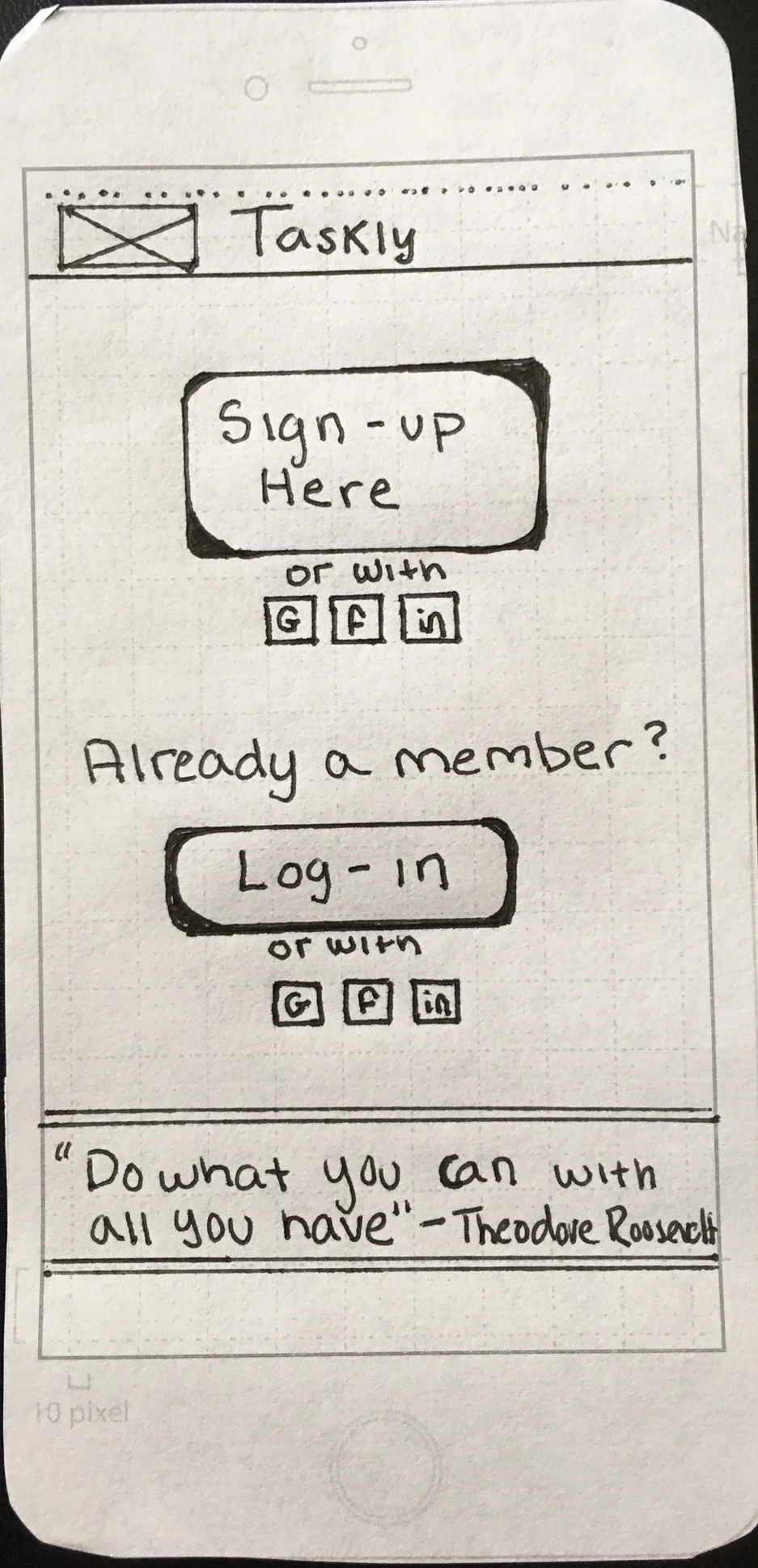
Paper prototyping
Using the results of the research I conducted and the newly formed information architecture, I went on to sketch paper prototypes to in on the visual interface . Once they were sketched out I conducted usability tests between each iteration to refine the designs before making them digital. For the prototypes I focused on two user flows: logging in and creating a new project.


Digital Wireframes
Once final usability tests were conducted for the paper prototypes, I transformed the flows into digital wireframes using UXPin and Sketch. The first set of wireframes I created for logging in and creating a new project in mobile, tablet and desktop can be seen as an interactive flow in InVision.
Keeping the initial digital wireframes in black and white reduced the variables affecting a participant's response during in the usability tests, conducted with Usability Hub and Invision.
The wireframes below display the final design stages of the two flows before introducing aspects of emotional design, such as color and typography. As a result, the user feedback was directed towards the interactions and efficiency of the two flows rather than it's visual appearance:
Phone:


Tablet:


Desktop:


To go from the low fidelity prototypes to high fidelity designs I had to create a UI kit. Through the use of mood boards and style tiles I developed a better sense of Taskly's brand and personality. Once I chose the font, color palette, icons, etc, I updated the designs to reflect Taskly's refined identity.


FINAL DESIGN
Building Taskly from start to finish exposed me to every step necessary in the design process to create a user friendly design. Going from the research phase to organizing the information architecture to actually designing the app gave me a view into the wide range of aspects involved in a UX Design career.
With the user tests complete, the final designs polished and a complete UI kit, the wireframes are ready to be shared with the developers.


