AVERA.MX
Project Overview
AVERA is a Mexican company specializing in sustainable and stylish home appliances, including stove tops and water heaters. The brand is well regarded for its reliable products and commitment to exemplary customer service.
The project originated from the client's desire to take ownership of his e-commerce rather than continuing to rely on third party vendors like Amazon. To make that shift successful, my approach centered on two priorities: implementing full e-commerce capabilities and designing with a mobile first mindset.

Problem Statement
AVERA's most pressing problem at the start of this project was the absence of any direct e-commerce infrastructure. The client brought important market context to our initial conversations: Mexico's e-commerce market, like much of Latin America, is still a fraction of the size and maturity of the United States'.
Rather than seeing that as a limitation, he recognized it as an opening. Getting ahead of the e-commerce curve in Mexico's market would give AVERA a meaningful advantage over competitors who had yet to make that investment.

Users and Audience
Many of AVERA's customers are first-time buyers over the age of 30, and that shaped which aspects of the experience I chose to prioritize.
Intuitive. The site's information architecture and content needed to get out of the user's way. The faster a visitor can move from browsing to checkout, the more likely they are to follow through on a purchase.
Informative. The CEO noted that a common source of customer complaints was buyers ordering the wrong item. Ensuring each product page carried clear, detailed information was a direct response to that friction.
Simple. For customers accustomed to texting the company directly or shopping through Amazon, the bar for ease of use is high. The experience needed to feel immediately familiar and navigable, with no learning curve.

Roles and Responsibilities
The team consisted of four people. The CEO, the Customer Experience Director, the E-commerce Director and myself.
For this project my role resembled that of a Full-Stack UX Designer because I was in charge of the UX design, UI design and the Shopify back-end development where I uses CSS and HTML to customize the site.
Scope And Constraints
Web Development: Even though we purchased a template to build the site on Shopify, my ability to customize was limited. This meant I had to edit the template’s code by learning some CSS and HTML.
Language: I am fluent in Spanish but my design and business vocabulary is limited. Thankfully, the client is understanding and knows English so there was no problem when I had to use ‘Spanglish’ to make sure I was getting the right message across.
Location: The company is based in Mexico City and I live in San Francisco CA. Even though the time difference is not too bad it still exists.
Project Process

Step 1: Understand Project Goals, Current Site Design, and UX Strategy
I began the project with a series of video calls with the client to understand his goals for the revamp.Two priorities emerged clearly: modernizing the site's UX/UI design, and giving customers the ability to purchase directly from AVERA rather than being redirected to a third party vendor like Amazon.
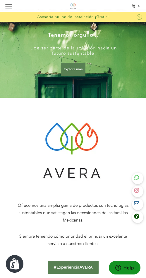
To establish a baseline, I conducted an initial review of the existing site. Upon entering, visitors were met with a two-image slideshow followed by a section covering AVERA's mission and vision.
To gut-check my first impressions, I ran a quick informal experiment, asking a few friends what they thought the company did based on the landing page alone. Many assumed it was some kind of non-profit clean energy company.
That response confirmed what I was observing: it wasn't immediately clear what AVERA actually sells, which on its own could deter new visitors from exploring further.
The broader experience was built around informing rather than converting. AVERA's identity revealed itself gradually as you scrolled — first a pledge to sell sustainable, environmentally friendly products, then a emphasis on customer service, and finally a mention of household products for Mexican homes.
It wasn't until the second About Us section that the product category became apparent. Continuing down the page, visitors eventually reached a category landing page with a brief catalogue overview, followed by a contact form and a footer that was partially cut off in mobile view.
If a visitor wanted to make a purchase, they were directed to reach out via WhatsApp or shop through a third party vendor entirely.


Site before changesStep 2: Research and select an internationally friendly e-commerce platform
AVERA is a Mexican company with a small catalog of products. However, the company and their product selection is growing quickly. The platform we selected had to be compatible with international e-commerce and must be good for scale, which is why we decided to use Shopify.
Step 3: Review template options and research best practices
Steps 2 and 3 required many hours of online research and communication between myself and the client to be 100% sure of our platform. We selected Shopify because it covered all our bases and is widely considered to be the best of its kind.
Step 4: Heuristic Analysis and Initial Sitemap
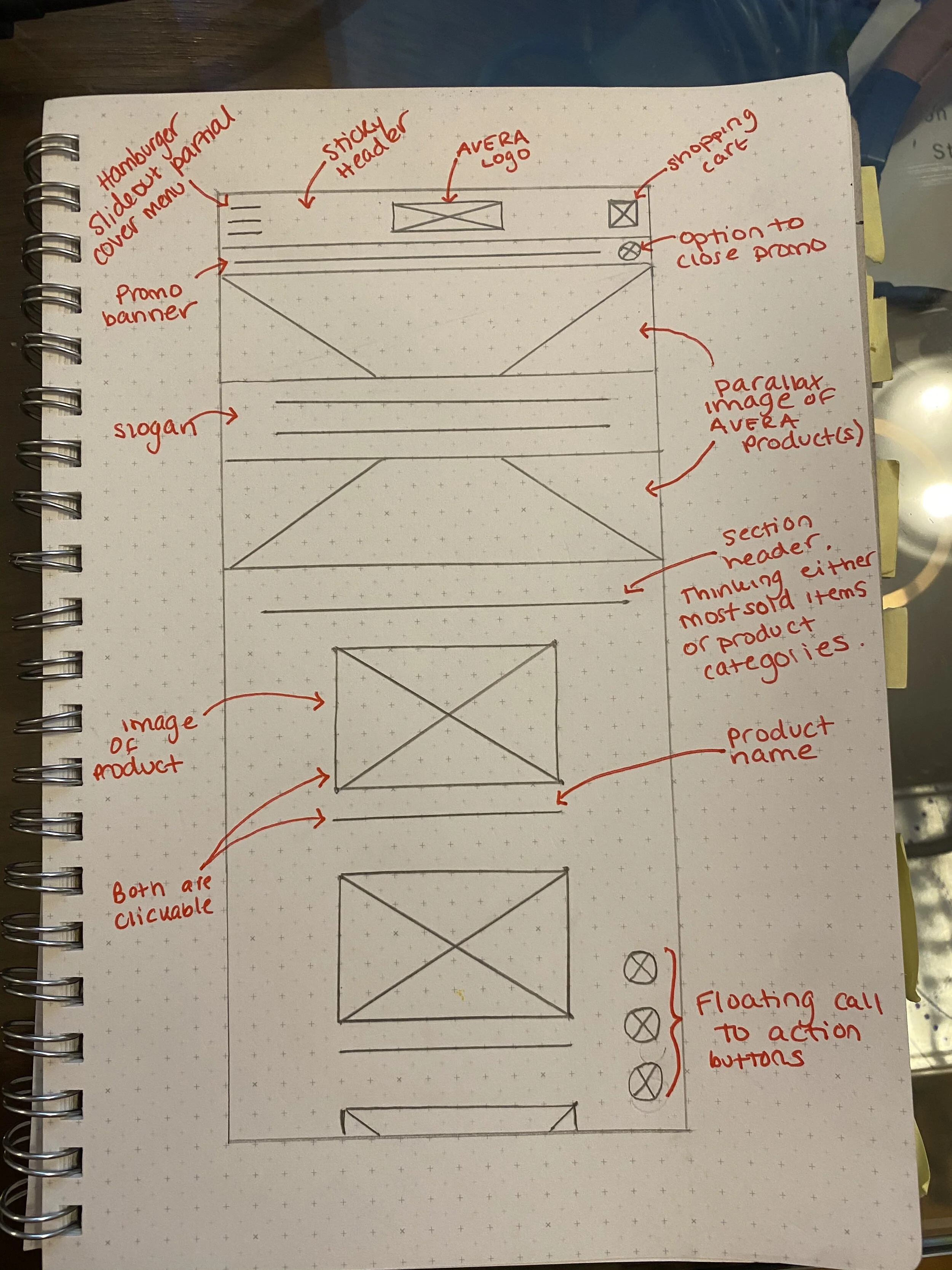
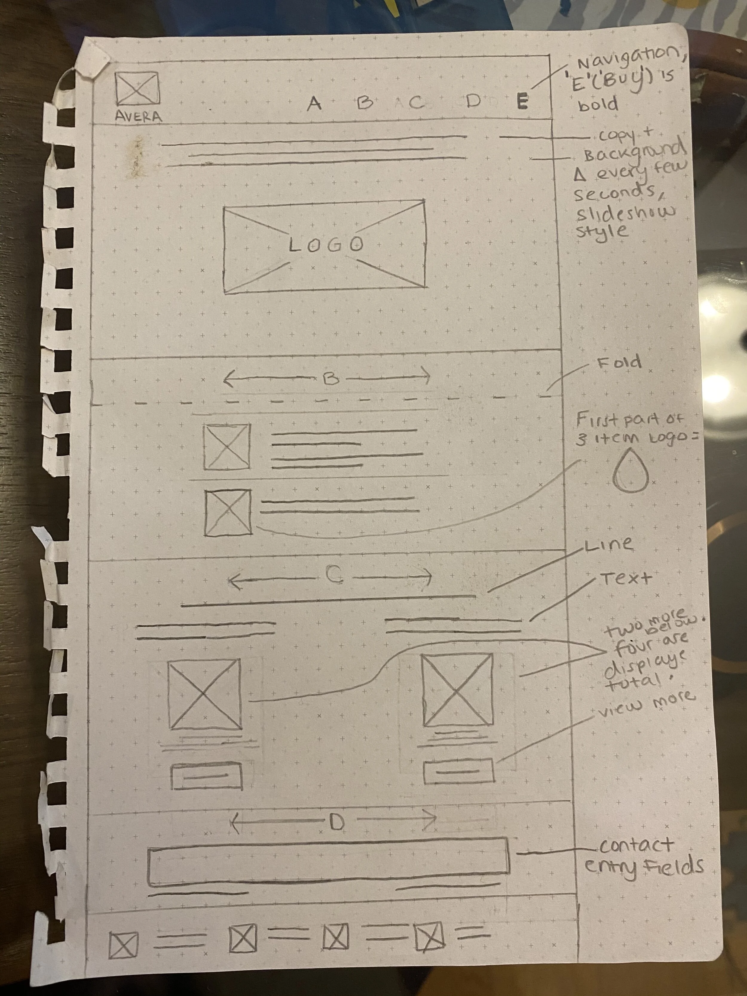
I conducted a heuristic analysis of the existing site and used the findings to inform the first iteration of the sitemap for the new site. The mobile analysis surfaced four key observations.
The navigation menu was static and permanently visible rather than floating, which consumed screen real estate and created visual noise. A slide-out style floating menu would allow for better visibility and a cleaner overall layout.
Immediately following the image block, the site led with a company overview section, a missed opportunity to surface products earlier and drive conversions. The mission and vision copy, while well-intentioned, read as lengthy and dated and would benefit from a refresh in both tone and length.
Finally, the green dividers and icons used throughout the site to break up content felt decorative rather than functional, and worked against the minimalist direction the client wanted to move toward.
Step 5: Upload Old Site Content to Shopify and Create Paper and Lo-Fi Wireframes
With the audit complete, the work shifted into two parallel tracks.
On one side, I began migrating the existing content into the Shopify backend, uploading product descriptions, images, site copy, and catalogue information.
On the other, I was translating the audit findings into paper and lo-fi wireframes to establish the structure and screen flows for the new site.
Even working from a template, content organization and user flows require deliberate decisions that don't happen automatically, and the wireframing process was where those decisions took shape.


Step 6: Create New Site on Shopify
With the content migrated and the wireframes in place, we had a solid foundation to begin building.
Before moving into production, I ran through one additional sitemap iteration with the client to ensure we were aligned on structure and direction before committing to the build.
From there, I used the finalized wireframes to guide the organization and layout of the content within the Shopify template.