
ShopAllHub.com
Rethinking an e-commerce site from the brand up.
As Design and Innovation Manager at Prepango, ShopAllHub was one of many workstreams I dug into. Traffic was coming in, conversion wasn't where it needed to be, and the brief was a redesign. But the real problem was that nobody agreed on what ShopAllHub was. Not what it was for, not who it was for, not why someone should choose it over anywhere else. Before a single screen got designed, that needed to change.
Old Site Design
New Site Design
The History
ShopAllHub is the e-commerce arm of Prepango, a vending machine company. Everything sold in the machines could also be bought online. A physical-to-digital channel built for repeat purchase. The site wasn't pulling its weight.
29.5k active users in my first quarter there. 76% engagement rate. But 89.7% of those users were on mobile, and the site had been built for desktop. The homepage tried to do everything at once: a hero banner, a brand grid, featured products, a clearance sale, email capture, a full product spotlight, more products, and an inconveniently long footer. Nothing was pulling focus. Nothing was earning trust.
Before any of that could be fixed, we had to take a step back to ensure our foundations were in order.
Old Mobile Landing Page Design
Before the Redesign, a Reset
A few weeks into my role, I noticed a trend among the senior stakeholders that changed the project’s trajectory. Every one of them had a different idea of the ShopAllHub identity. Different takes on the customer, the value proposition, the tone, the priorities. Building a new site on top of that misalignment would have been a waste of time.
I made the case to the CEO to pause the redesign and run a brand alignment workshop first. He agreed. See that case study here.
What came out of it was invaluable. A brand with a clear point of view: nimble, approachable, solutions-driven. A superpower of curated variety. A customer who values trust and ease above all else. The alignment gave us a foundation the new site could actually be built on, and with that in place, discovery could begin.
Understanding Who We Were Designing For
I built the persona and journey work from analytics first, not assumptions. The data confirmed what the site already suggested: a mobile audience, arriving through social and direct channels, skewing US-based, with LEGO driving the most engaged traffic.
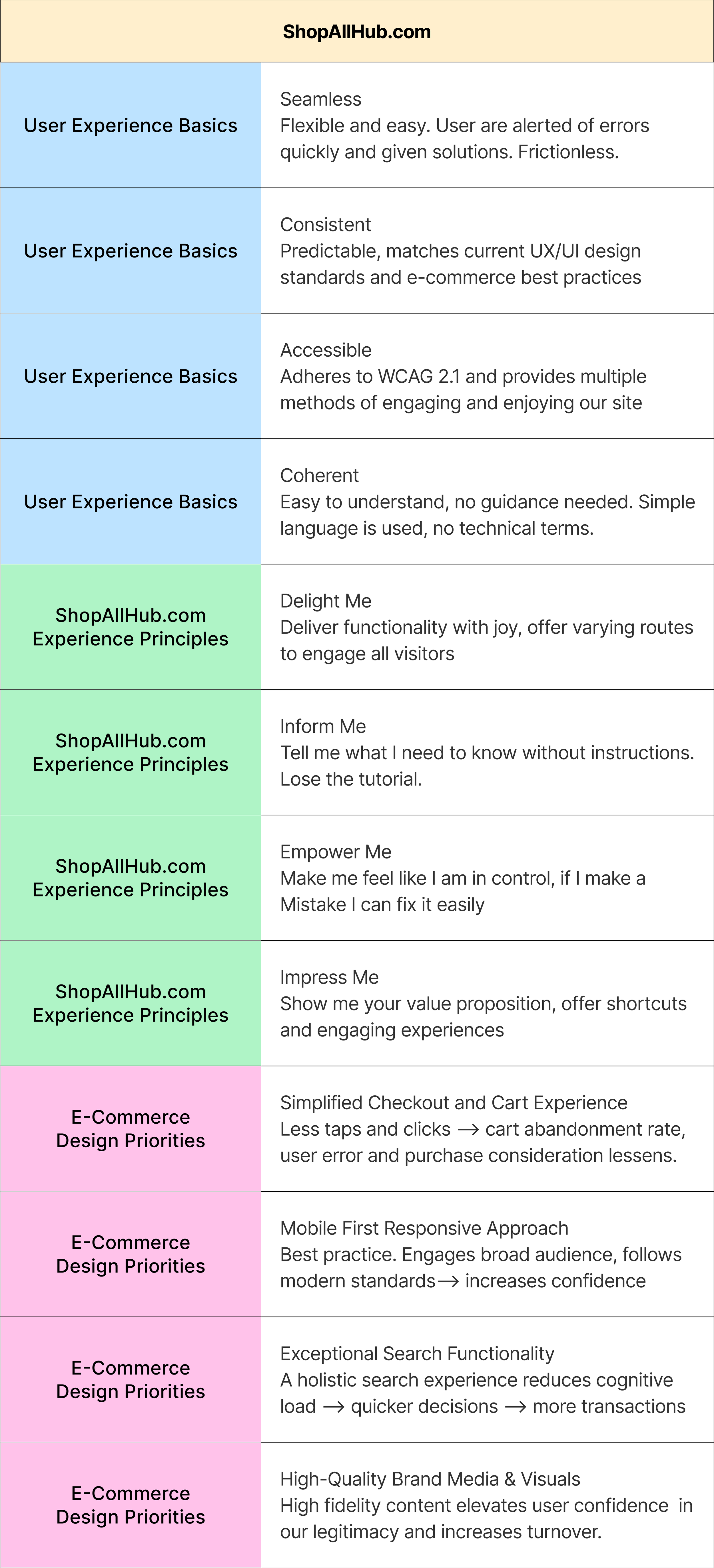
From there I mapped five user journeys, each paired with a persona that reflected someone Prepango was already reaching or trying to reach across their omni-channel ecosystem. For each journey I ran a heuristic analysis, evaluating the experience across three lenses: UX basics, ShopAllHub-specific principles, and e-commerce design priorities.
Journey Mapping and Personas
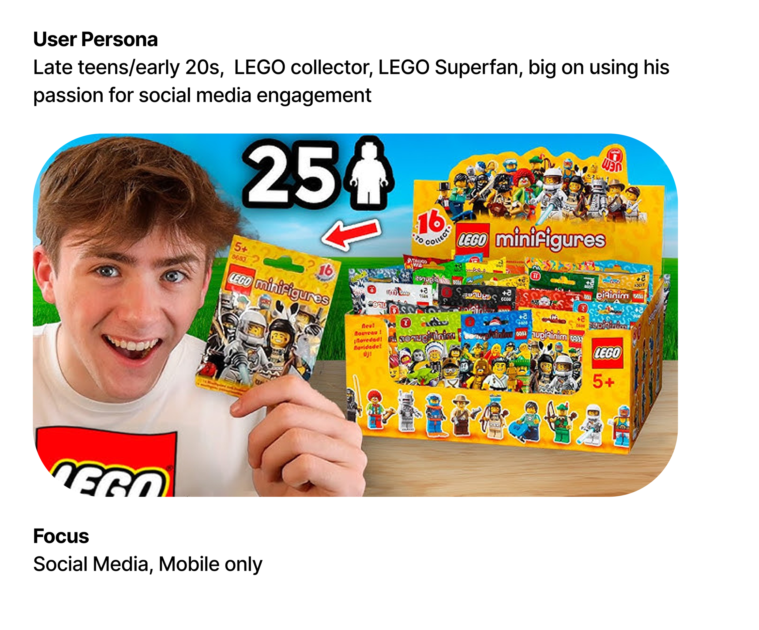
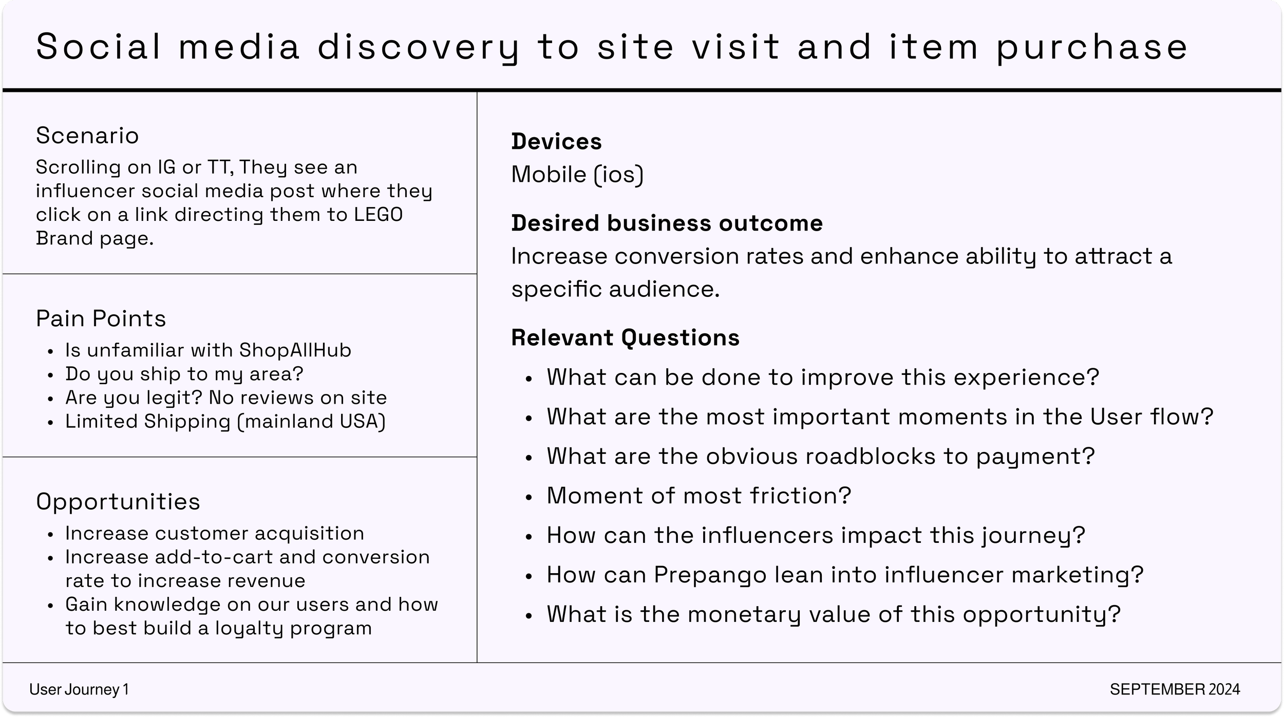
Journey 1:
Social media to site to purchase.
A LEGO superfan in his late teens or early twenties, coming in from an influencer post on Instagram or TikTok, on mobile, ready to buy if the site can answer his first question: is this legit?
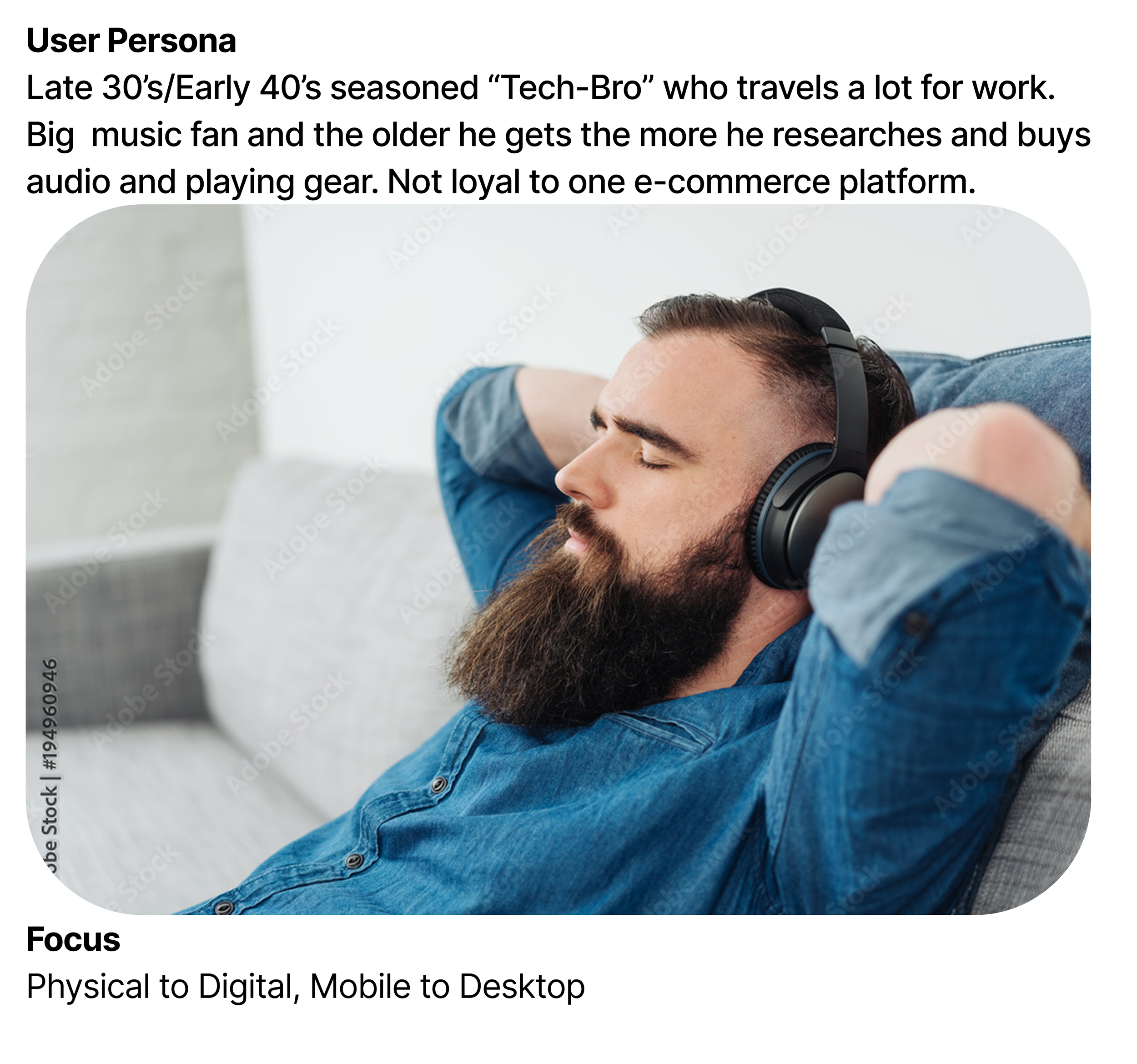
Journey 2:
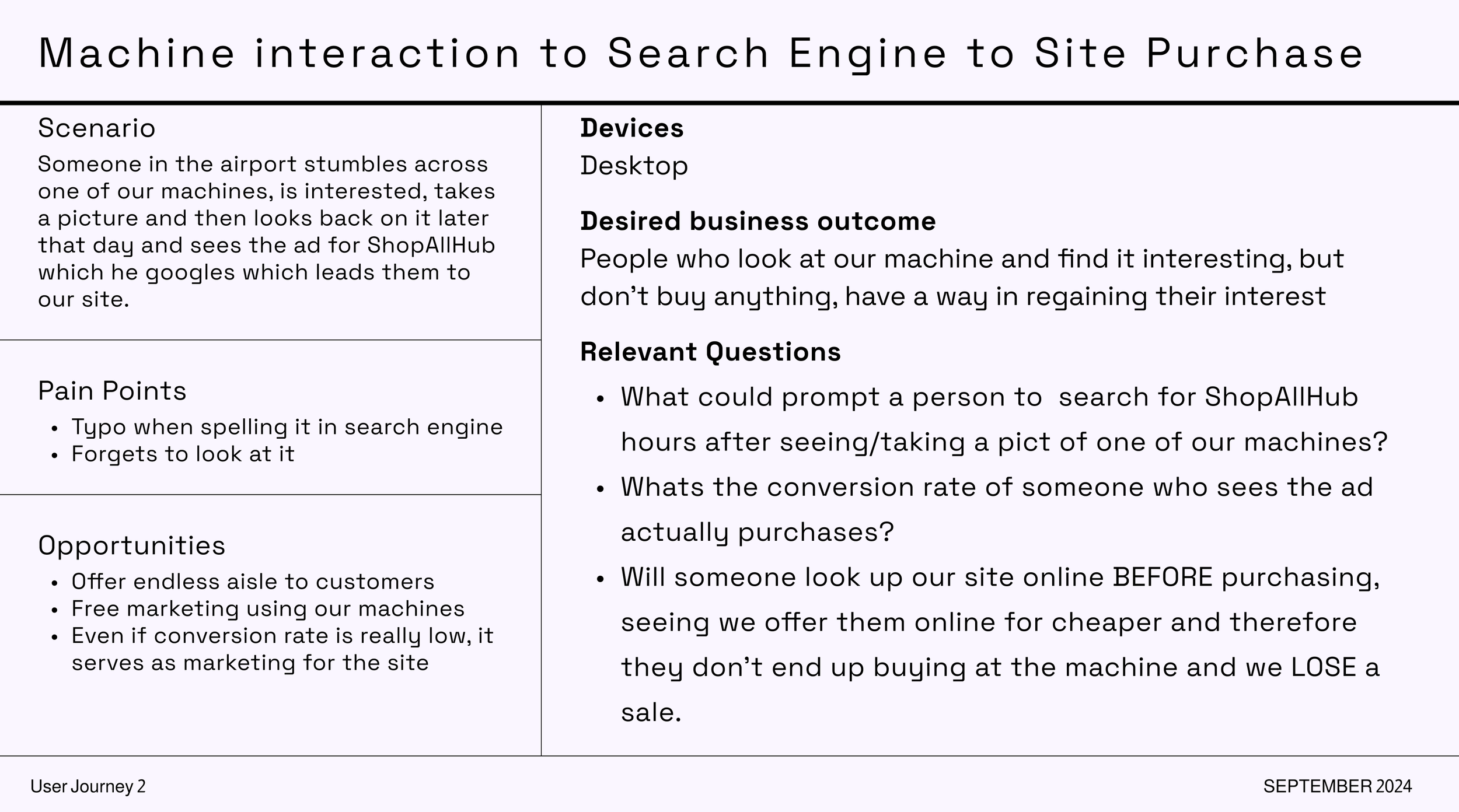
Machine to search to site.
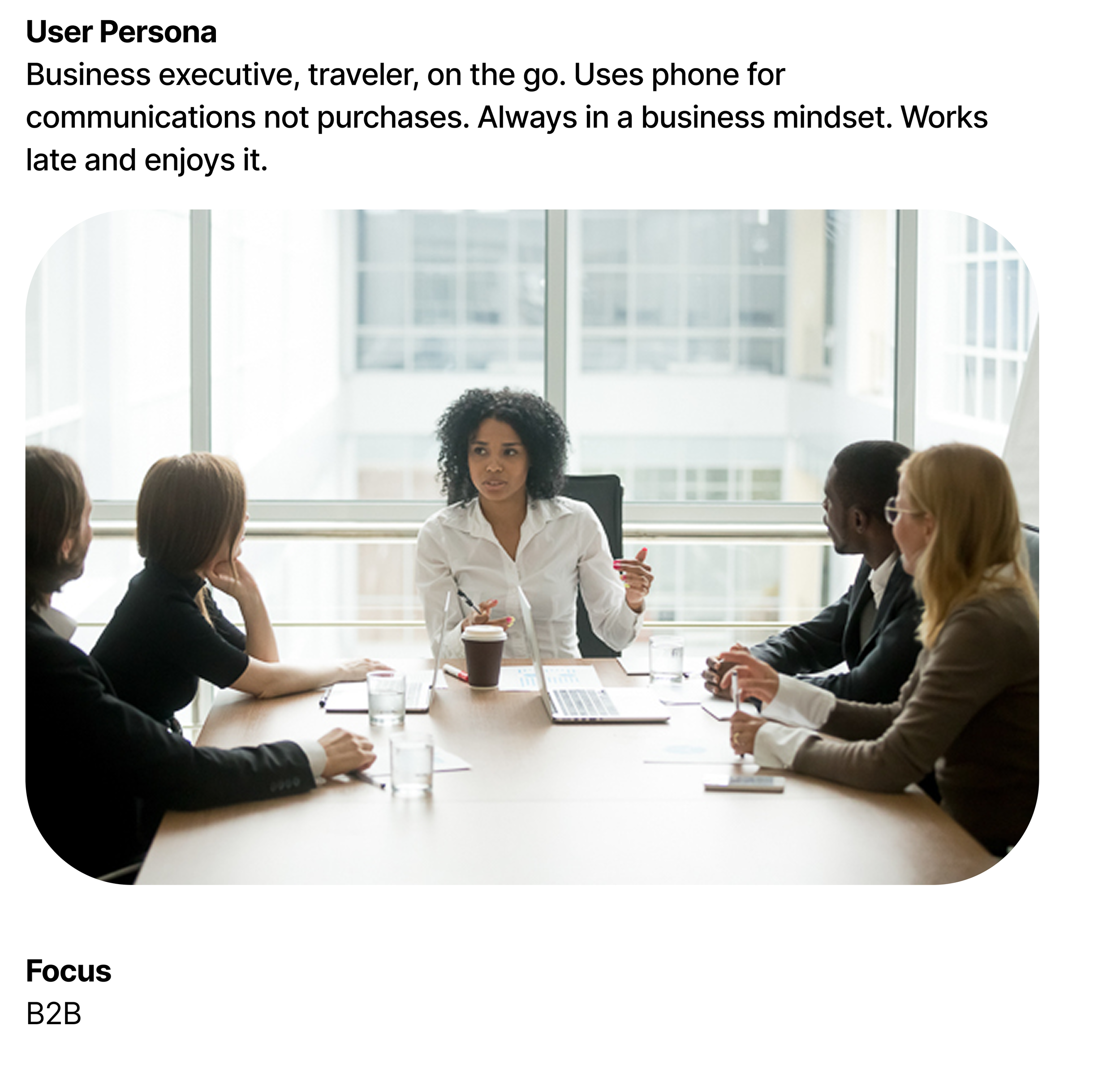
A tech-savvy traveler in his late thirties, encounters a machine at the airport, takes a photo, googles it later on desktop. The opportunity: catch him before he forgets. The risk: show him the site and lose him to a more credible competitor.
Journey 3:
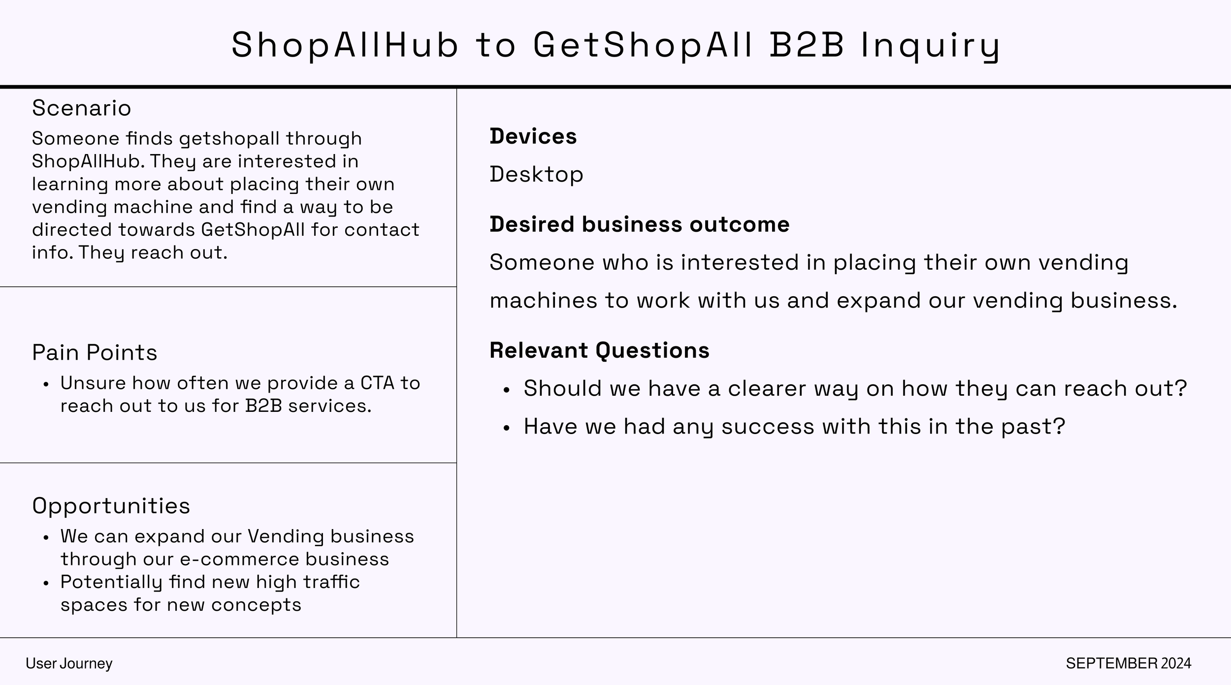
ShopAllHub to B2B inquiry.
A business executive who finds the site and starts thinking about placing their own vending machines. An entirely different goal, an entirely different conversation.
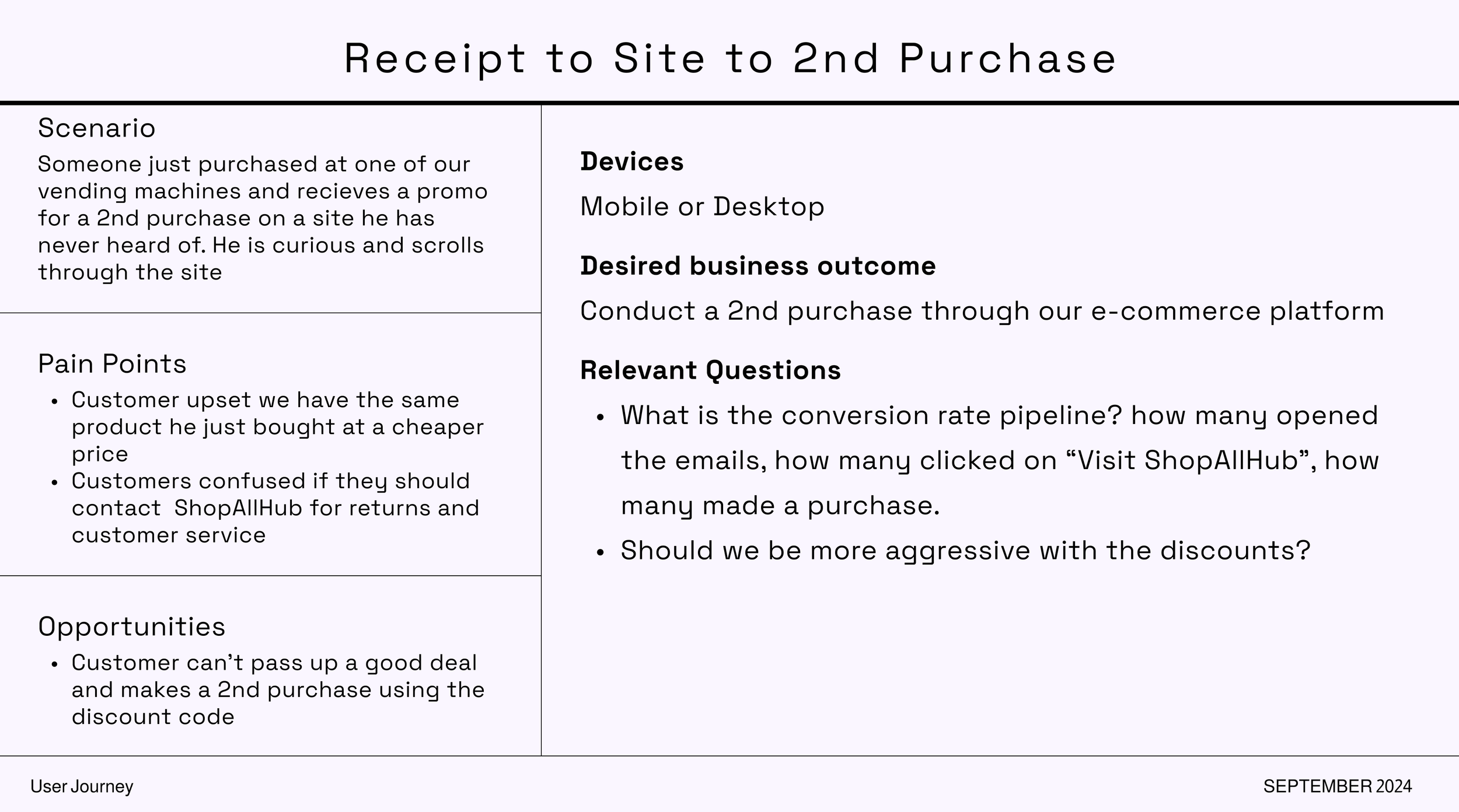
Journey 4:
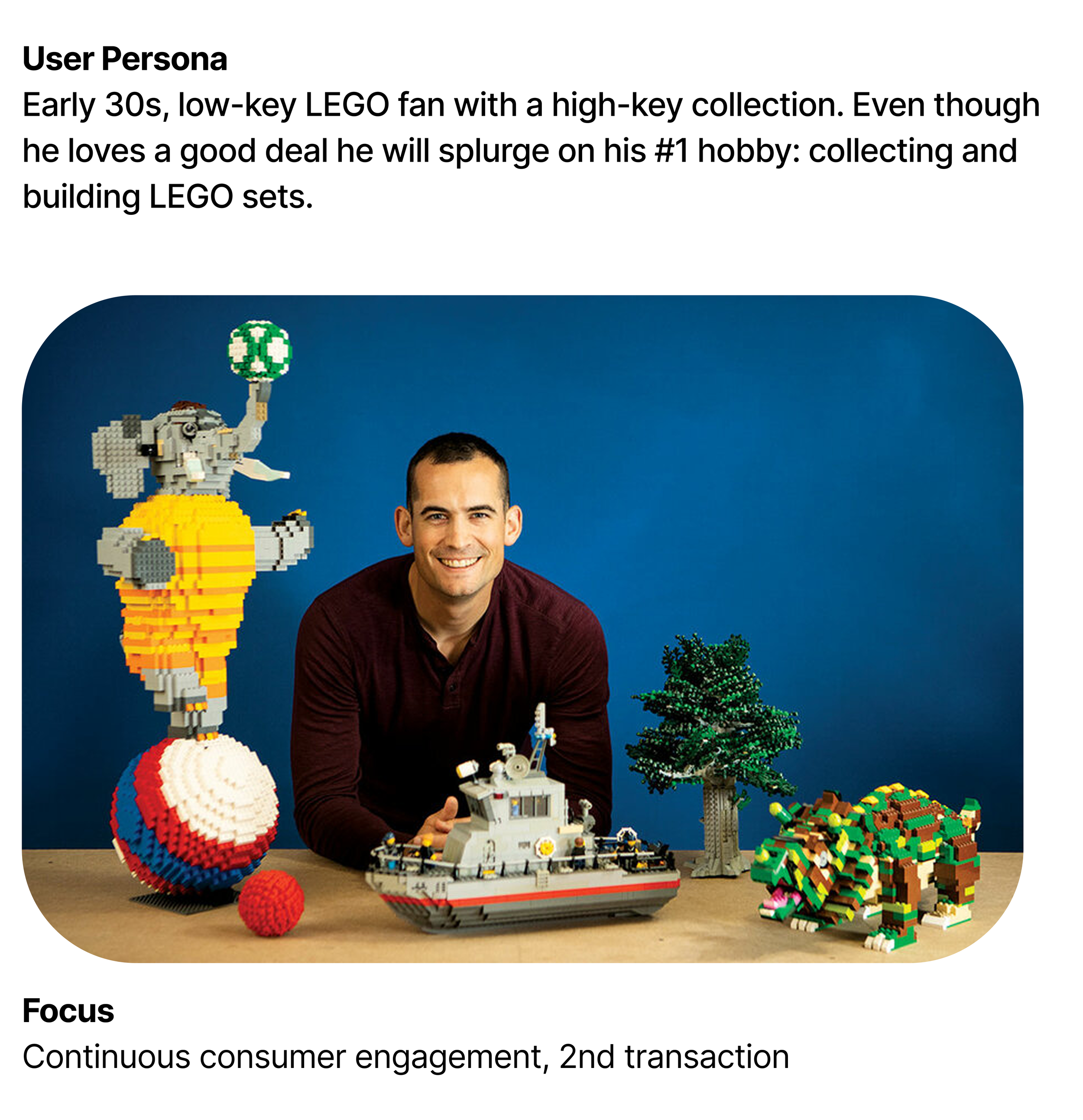
Receipt to second purchase.
A LEGO collector in his early thirties who just bought at a machine and got a discount code in the receipt email. He loves a deal, but he'll spend on his hobby. The job: make the site worth coming back to.
Journey 5:
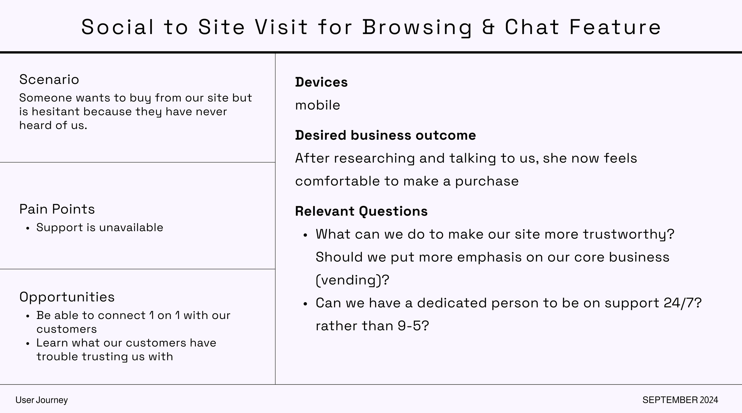
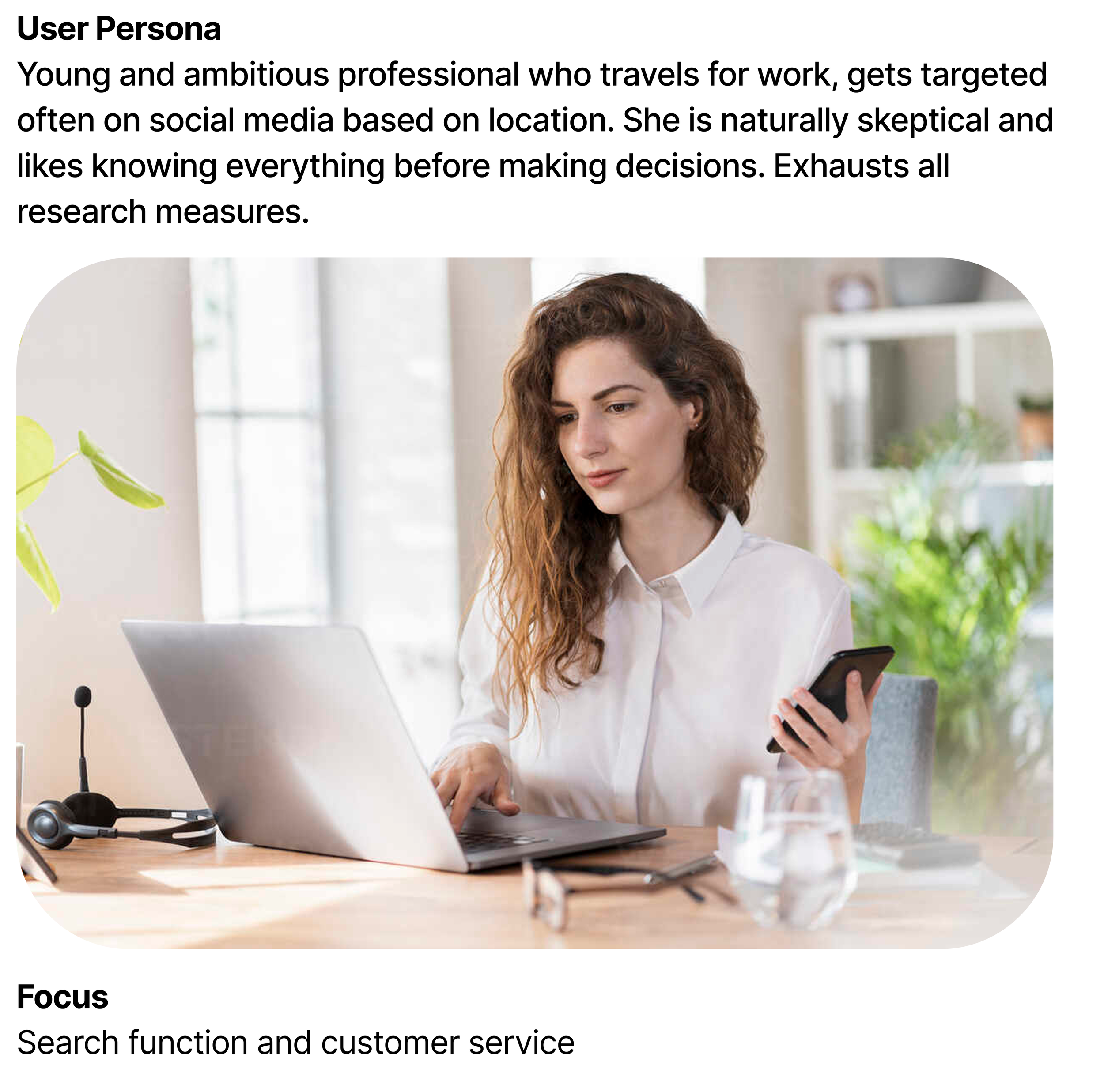
Social to browse to chat to purchase.
A young professional who is naturally skeptical, exhausts every research option before buying, and needs a responsive support channel before she'll commit.
The UX basics were mostly there. But the site wasn't consistent with modern e-commerce standards and wasn't accessible to WCAG 2.1.
The ShopAllHub experience principles were almost entirely absent. No delight, no clear value proposition on arrival, no sense the site knew who you were or why you were there.
The e-commerce priorities were where the real damage was:
The cart had no quantity limit.
PDPs had a broken payment options link that went nowhere, one of the fastest ways to kill purchase confidence.
Related products weren't showing related products.
The cart modal redirected users away from shopping when they hit "Continue Shopping."
Checkout violated basic form conventions: required fields weren't marked, shipping and billing were in the wrong order, and there was no way back to the cart without losing progress.
All fixable, yet they were all costing transactions. I ran competitive benchmarking across eight e-commerce sites to understand the gap between where the site was and where it needed to be.
The findings fed directly into the new direction.
What the Analysis Revealed
Discovery Artefacts
New Direction
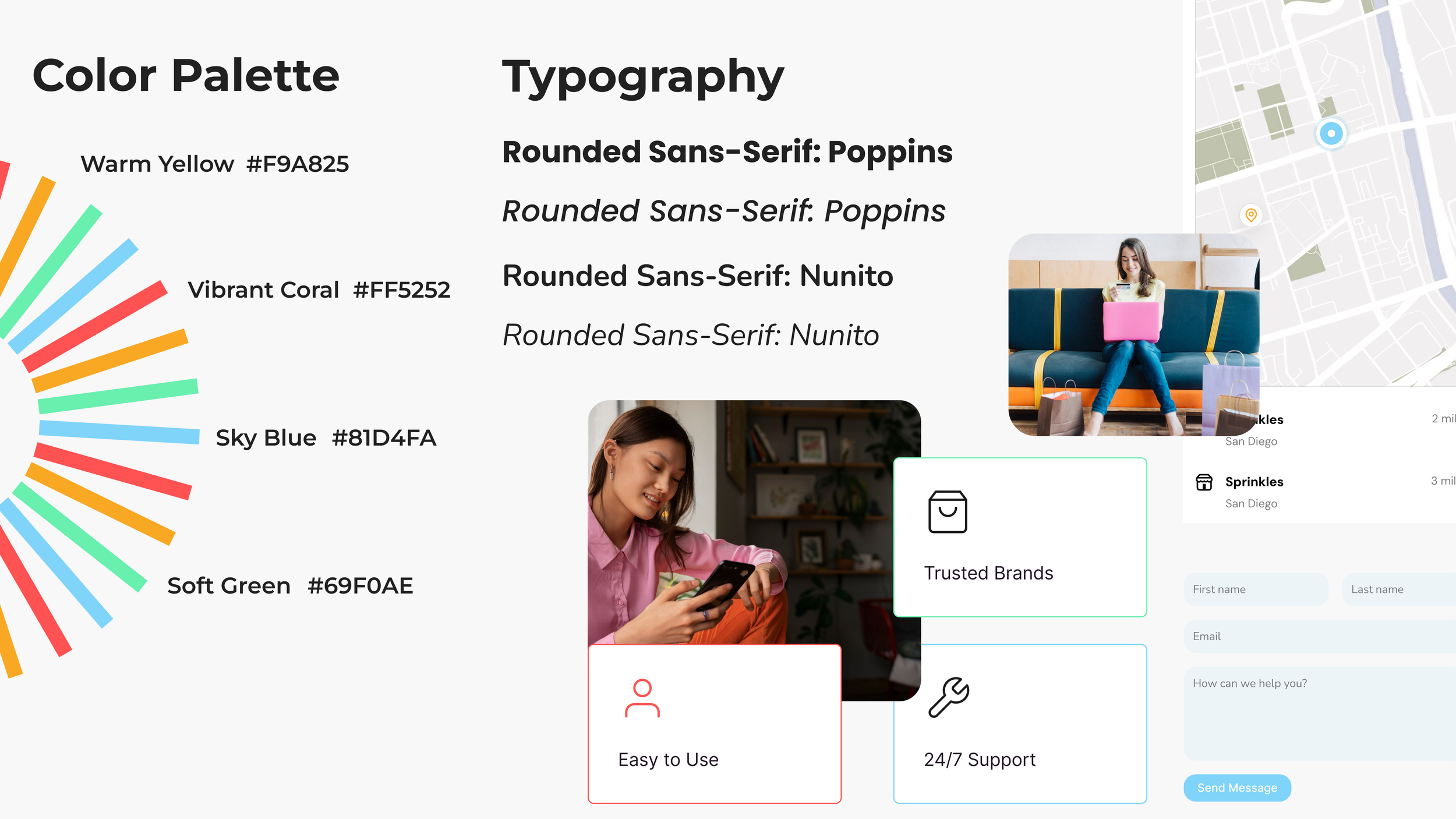
The brand workshop gave us something real to design toward: elementary, universal, approachable, and fresh. This meant stepping away from purple and switching to warm yellow, vibrant coral, sky blue, and soft green. We began to use rounded sans-serifs, Poppins for headers, and Nunito for body. Bright lifestyle photography and a visual language that felt confident without trying too hard would make the homepage exciting and inviting.
Approach
Before designing new pages or adding new content, I reskinned what existed using the new brand guidelines as the design system.
I set up tokens and variables in Figma, started building out a component library, and created a tracking page in the project file: existing pages screenshotted next to an empty frame for their redesign.
The plan was to prove the system on the homepage first, then roll it out through a template approach: info-heavy pages, PDPs, PCPs, company pages, checkout.
The homepage content hierarchy was restructured around a clear sequence: category offering up front, brands next because recognition was the primary trust signal for this audience, followed by an ecosystem explanation, deals, and a reason to come back. The sitemap defined navigation by level and interaction type, keeping the taxonomy simple and the decisions few.
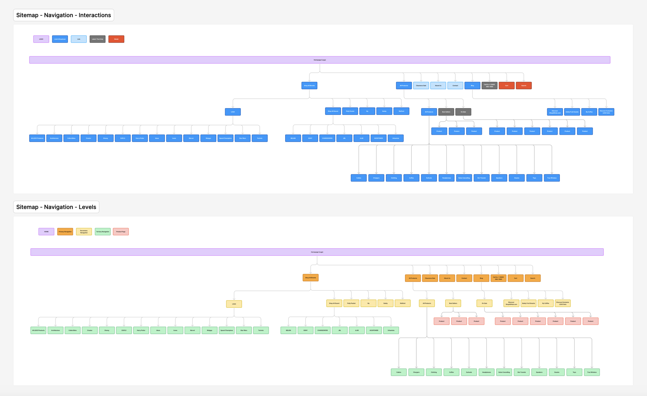
Sitemap by interaction type and hierarchy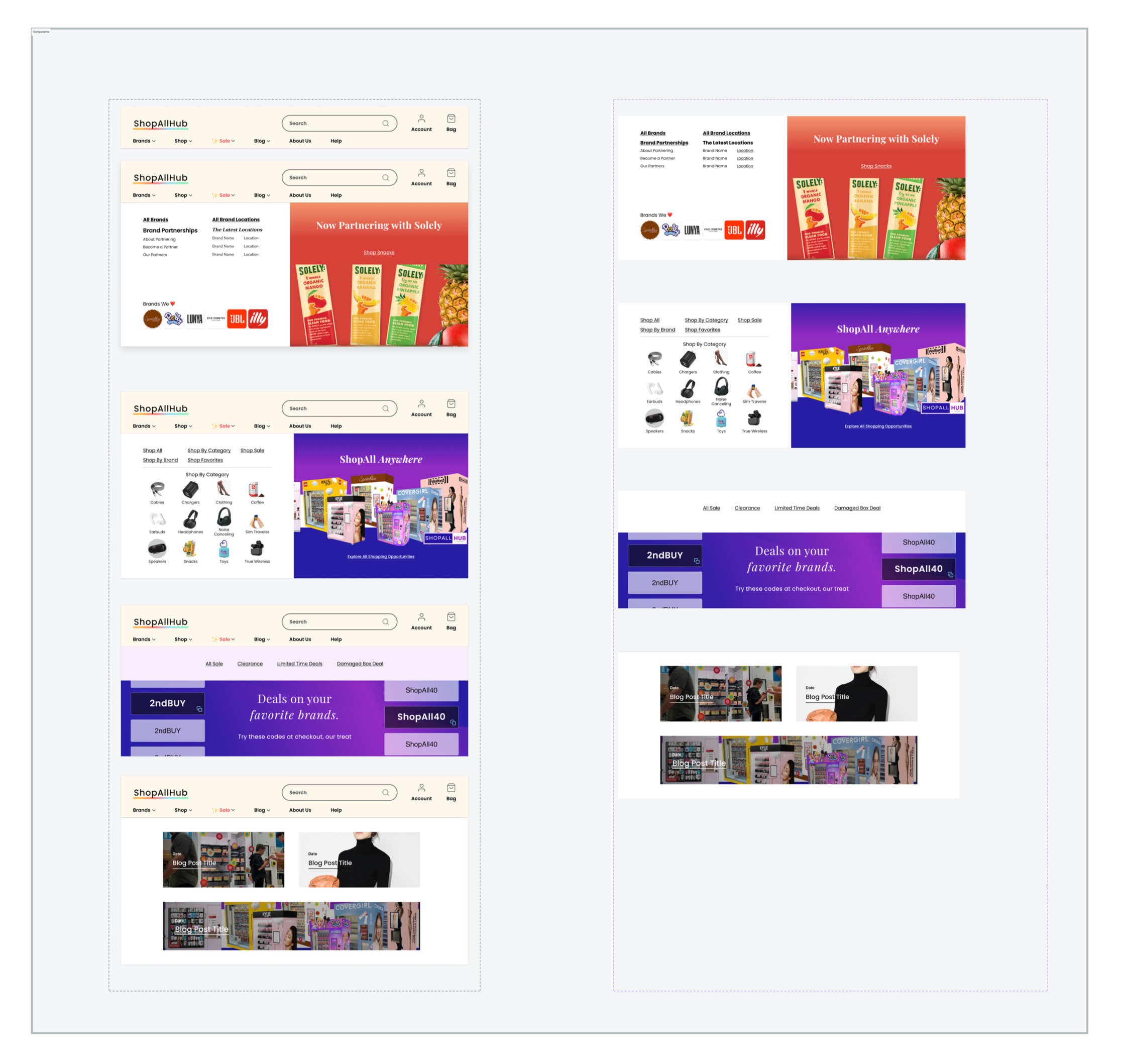
Mega Menu DesignMega Menu DesignDesign, Build, VQA
Once designs were handed off, I ran VQA with the dev team in Mexico, working through a prioritized sprint backlog across navigation, PDPs, cart, checkout, and homepage content. Some fixes shipped fast: navigation color on mobile, top banner copy, the broken PDP link, accordion components, cart modal behavior. Others hit the constraint we knew about from the start. Shopify plan limitations meant checkout modifications required an upgrade that wasn't in scope yet. The homepage launched before I left. New navigation, new content hierarchy, brand landing page template, all live. The dev execution didn't land exactly as designed and I didn't get to run a thorough VQA before leaving. Some of that is still visible in the live site.
Where We Landed
The homepage was the only page that shipped on my watch. The rest of the template rollout was scoped, sequenced, and ready to continue. I left before it did.
What I handed off was a system: brand guidelines, a Figma file with tokens, variables, and a component library in progress, a redesigned homepage, and a documented backlog prioritized for the next phase. The SEO work running alongside mine had already moved 27 keywords to the first page of Google and brought the site to 1.9k visits with strong retention. The foundation was there. Whether the team kept building on it, I can't say. But the site that launched knew what it was. That part was done.
Old Site DesignNew Site Design