
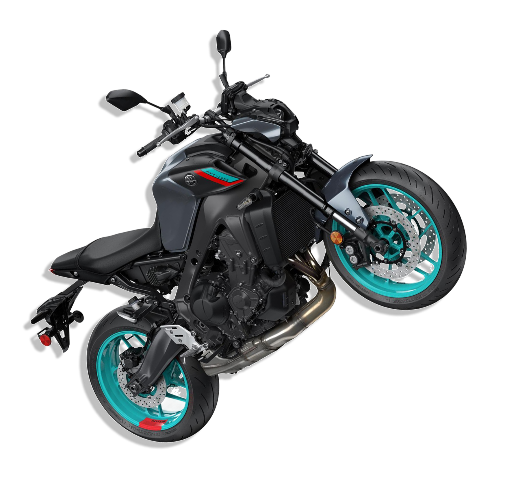
Yamaha Motor Sports
The Discovery
Twelve business units. One fragmented digital ecosystem. A year to fix it.
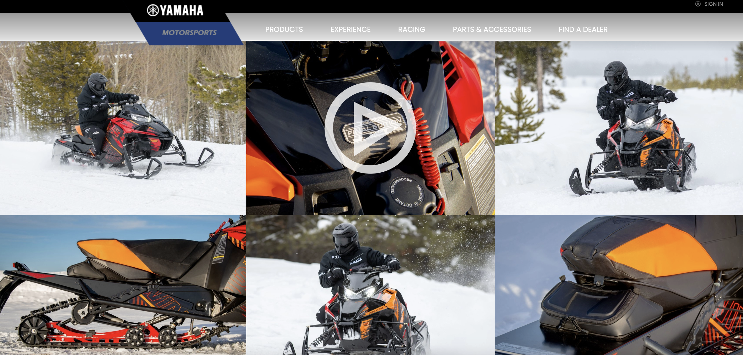
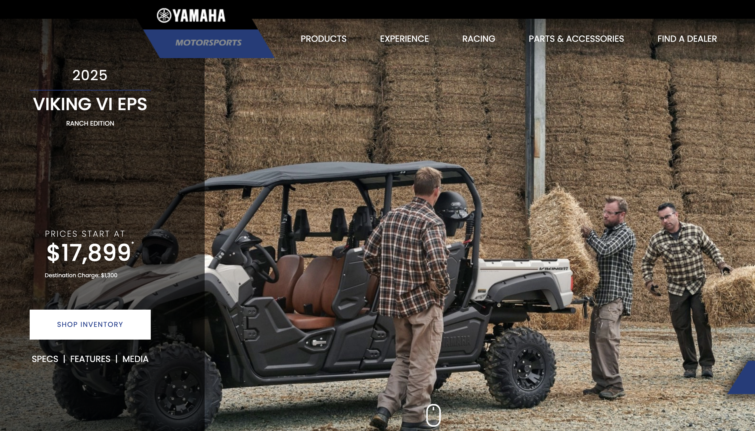
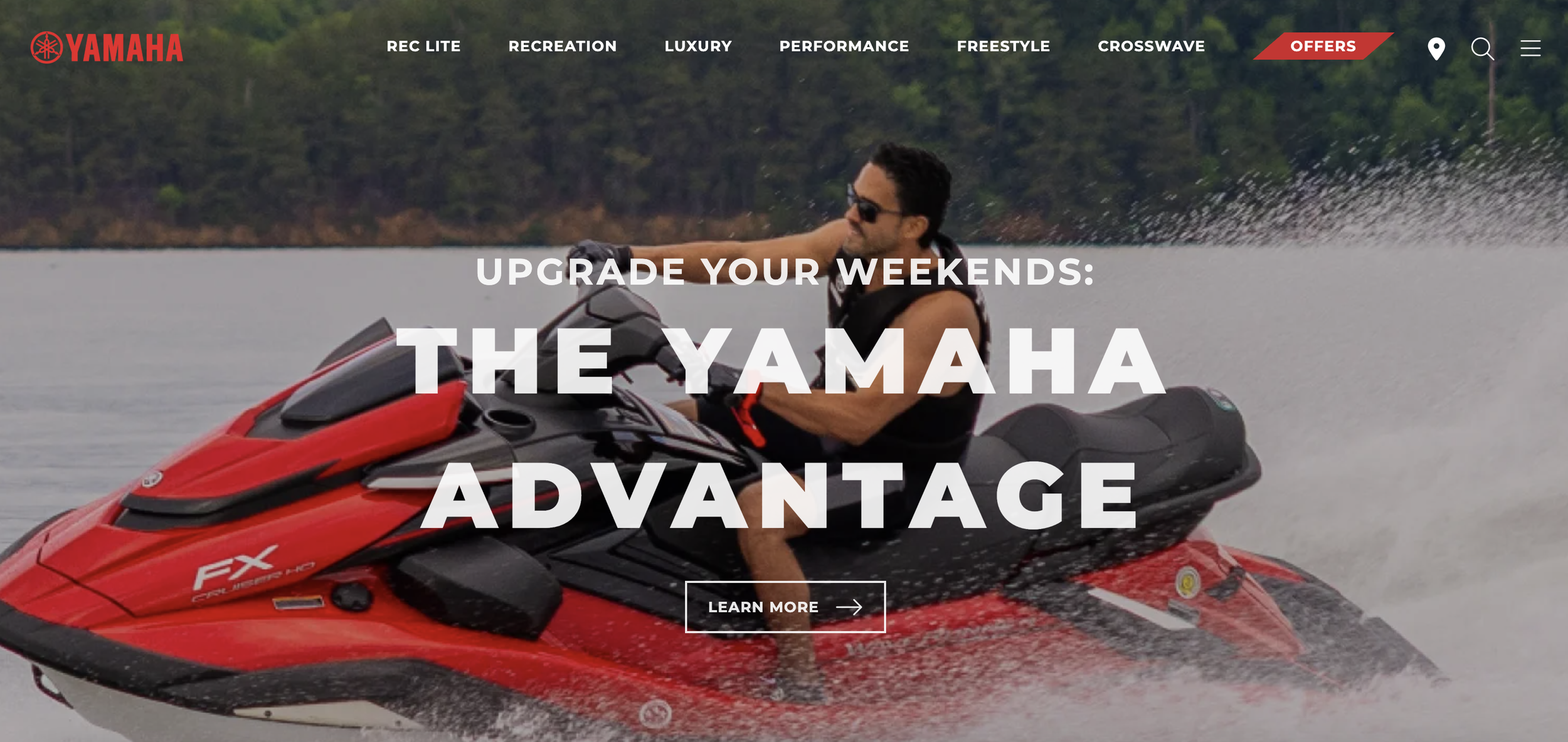
When Material+ brought me onto the Yamaha Motor Sports account, the challenge wasn't just a dated website. It was a sprawling collection of disconnected digital experiences where each business unit had its own visual language, logic, and rules. Golf Cars, Snowmobiles, and WaveRunners are all Yamaha, but they have unique personalities. A UX audit, stakeholder workshops, and user interviews made the cost of that fragmentation concrete fast.
Most shoppers could only wishlist a product rather than actually buy it. Cart abandonment on the legacy site sat at 69%, translating to an estimated $260 billion in lost orders. Getting business unit leadership into the same room revealed the other half of the problem: they were deeply siloed, with no shared vision of what One Yamaha could look like digitally.
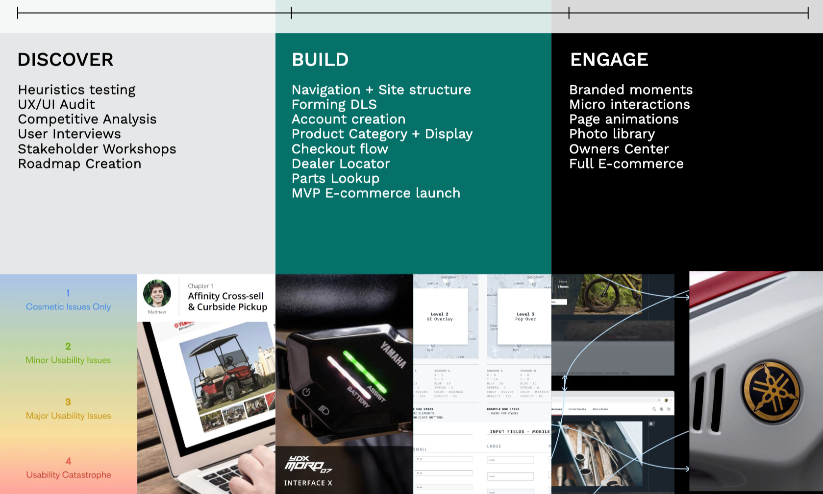
The redesign needed to start with structure, not visuals. Over a year and more than 20 two-week sprints, we rebuilt YamahaMotorSports.com from the ground up. Daily e-commerce users up 35%, engagement up 10%, bounce rate down 10%.
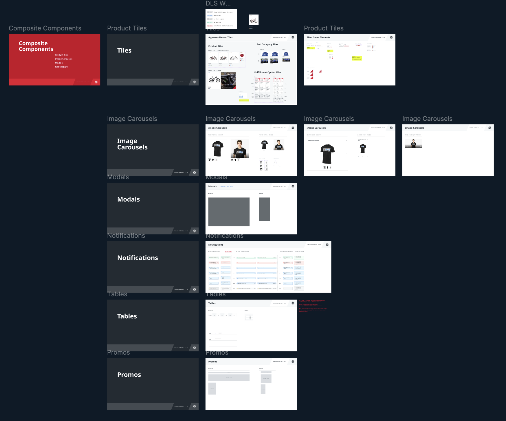
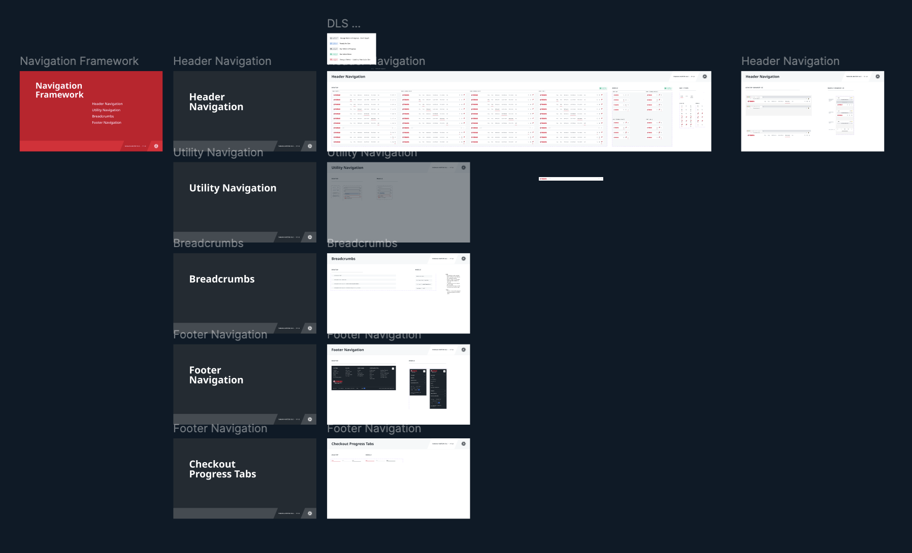
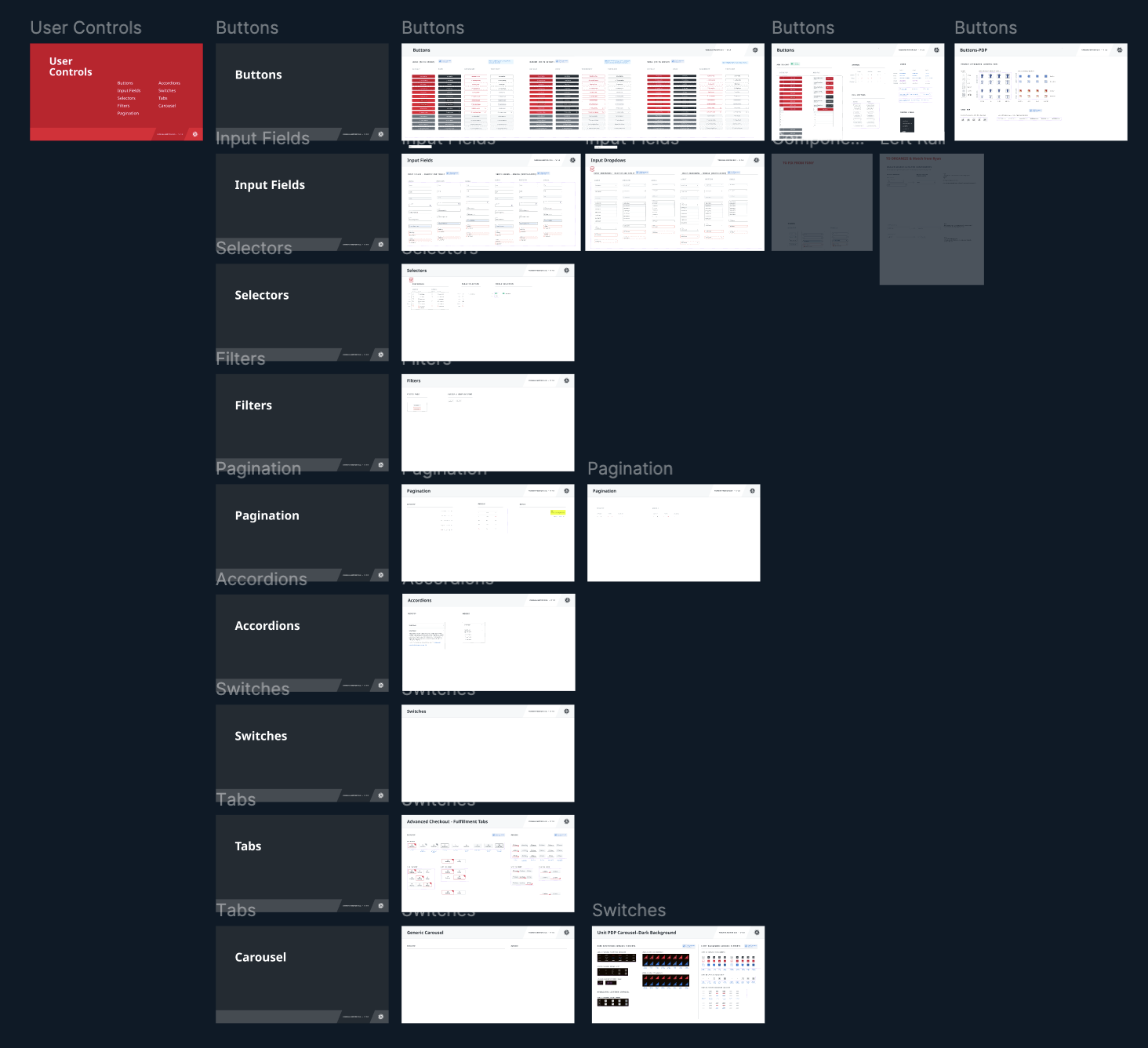
The Design System
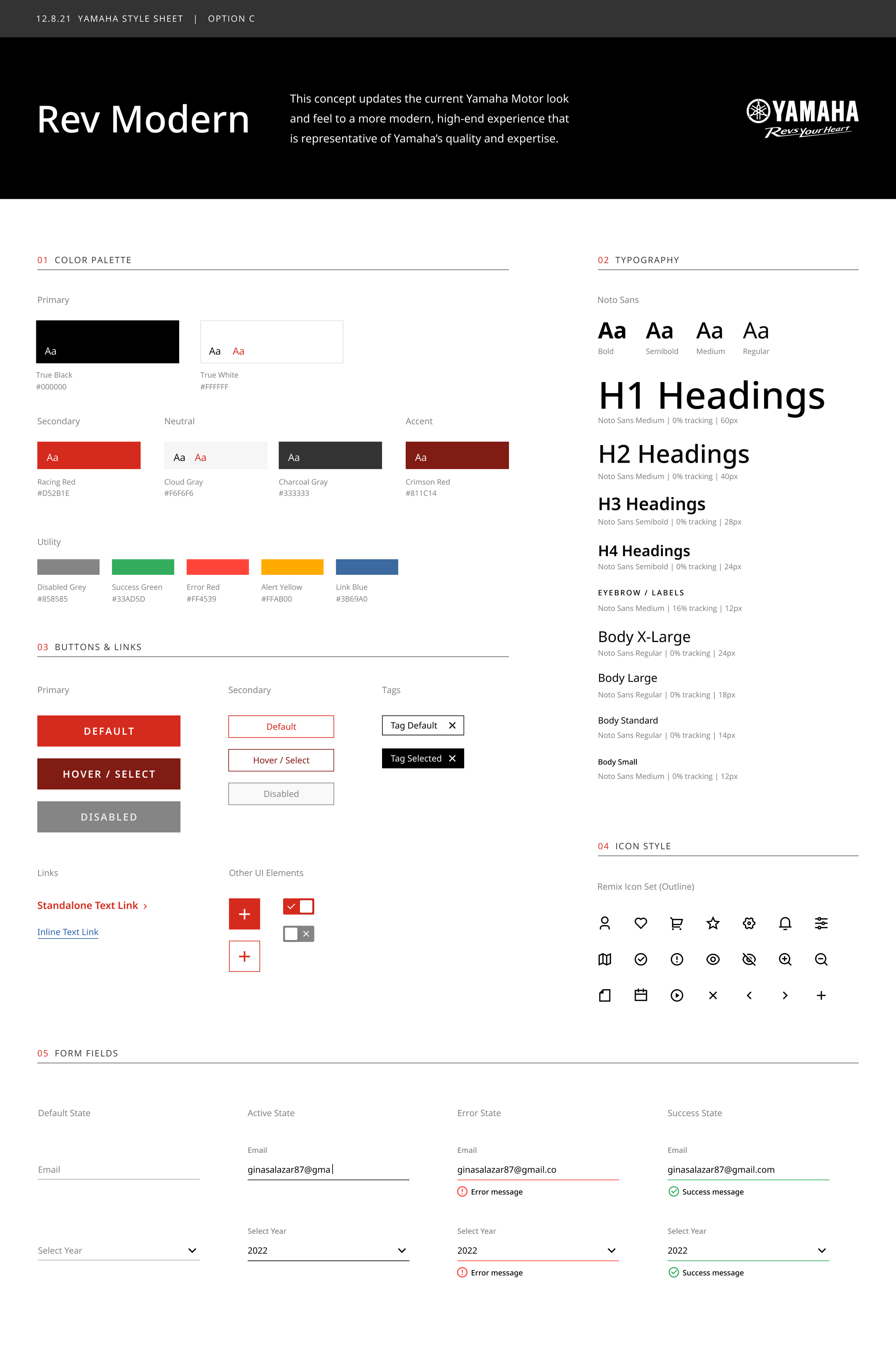
The Yamaha team didn't know what a DLS was, so before proposing one we had to show them what it meant. Example style sheets during a presentation did the job, and taught us something in the process: balancing One Yamaha against twelve distinct business unit brands was going to require restraint. We landed on red and black as the global base, with individual BU personalities living in product pages and branded moments rather than competing in the navigation.
We proposed three directions. The client chose Rev Modern: high contrast, bold typography, premium. Grounded in Yamaha's motorsport heritage.
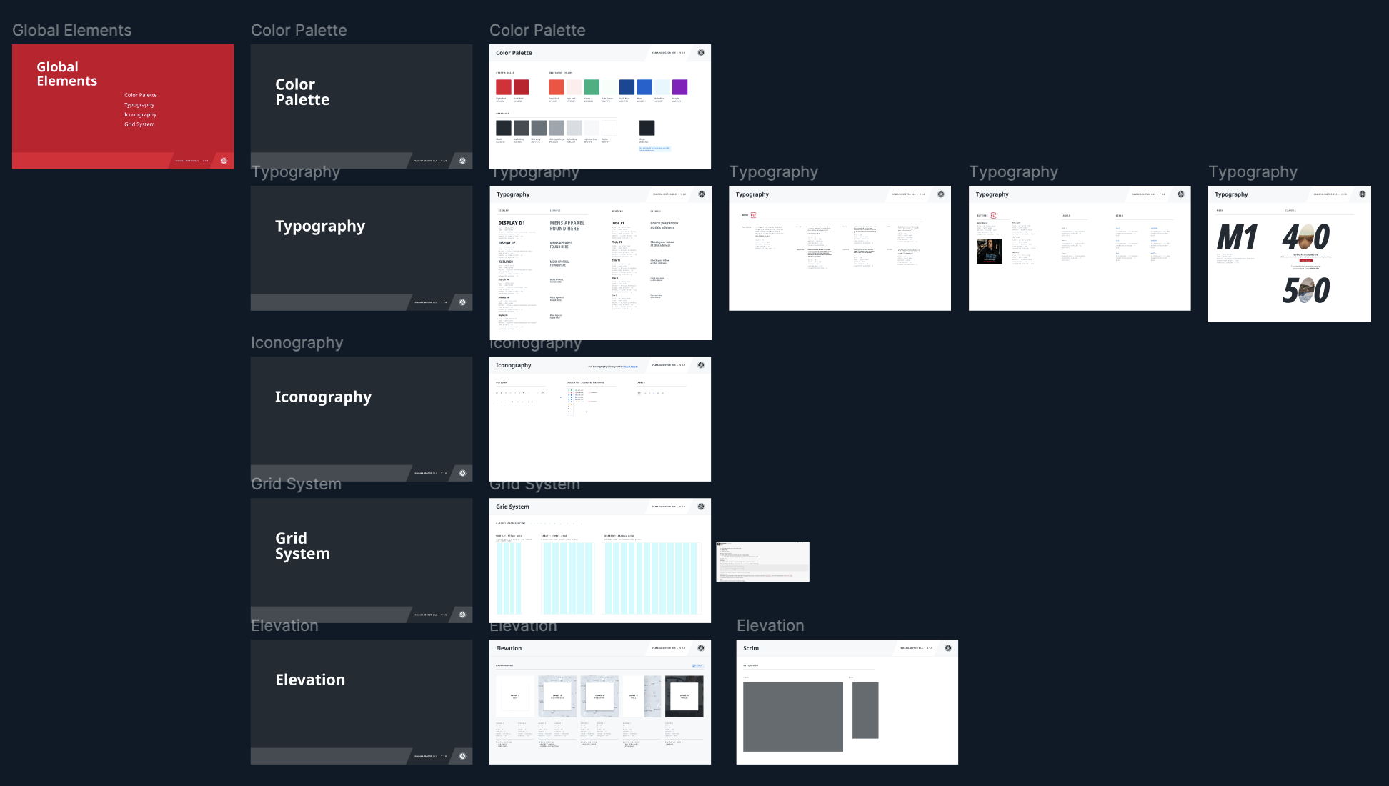
From there we built the DLS from scratch. Global foundations first, then navigation patterns, composite components, user inputs, and product tile structures. I contributed to the build throughout and owned ongoing maintenance sprint by sprint, keeping the system coherent as new features came online.
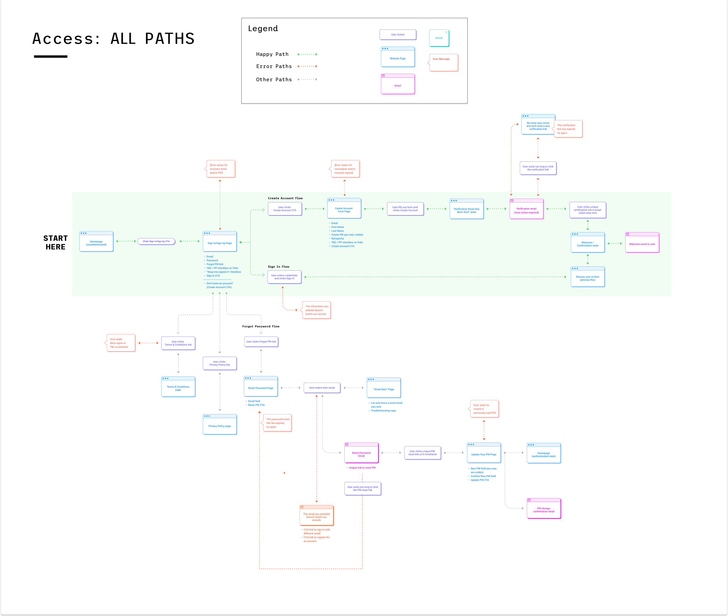
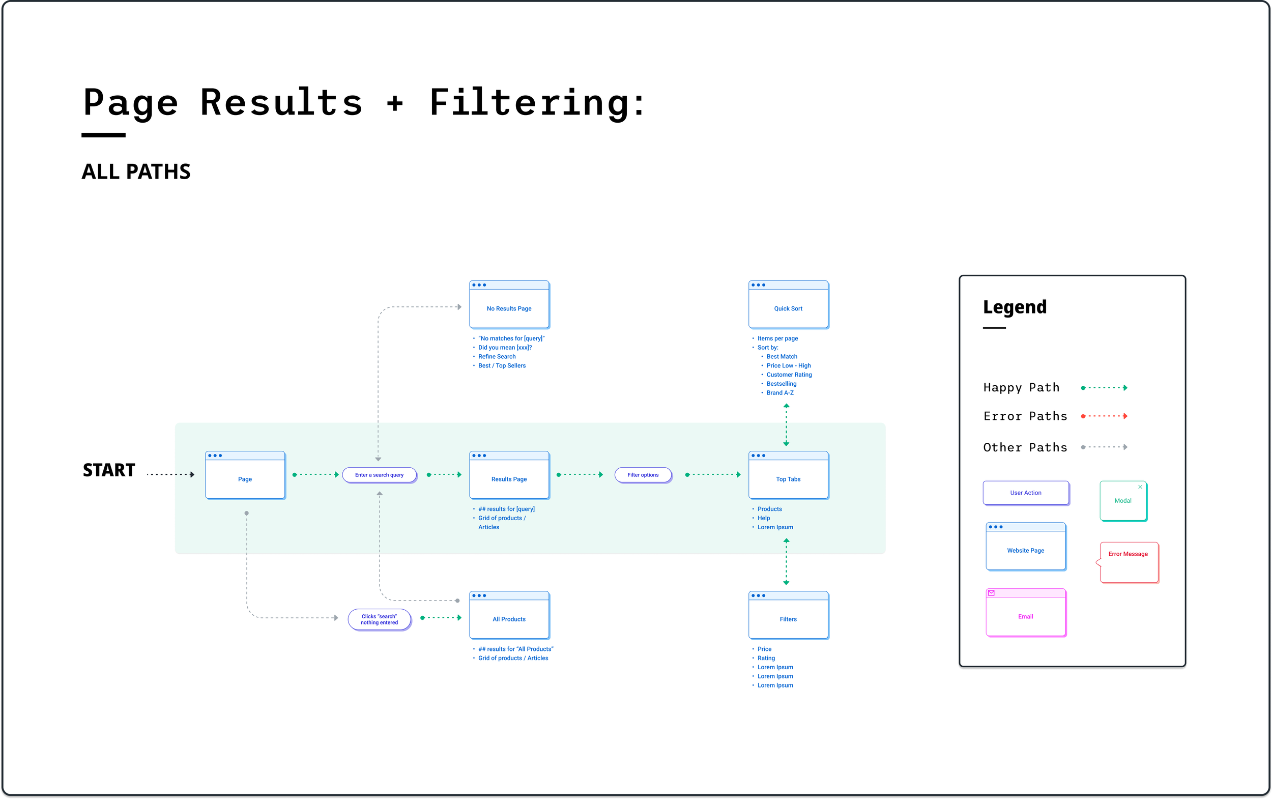
The User Flows
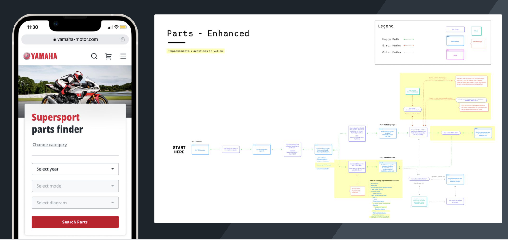
Every section of the site had its user journey fully mapped before a single wireframe was drawn. Happy paths, error paths, edge cases, all documented and circulated with the client before we moved into design. That kept us from designing ourselves into corners and gave engineering a shared reference from day one.
The flows covered account creation, sign-in, search and filtering, parts lookup, and checkout. For navigation, the product design and content strategy teams worked together to test our structure against real user mental models and build an information architecture that could accommodate all twelve business units without overwhelming anyone landing on the site.
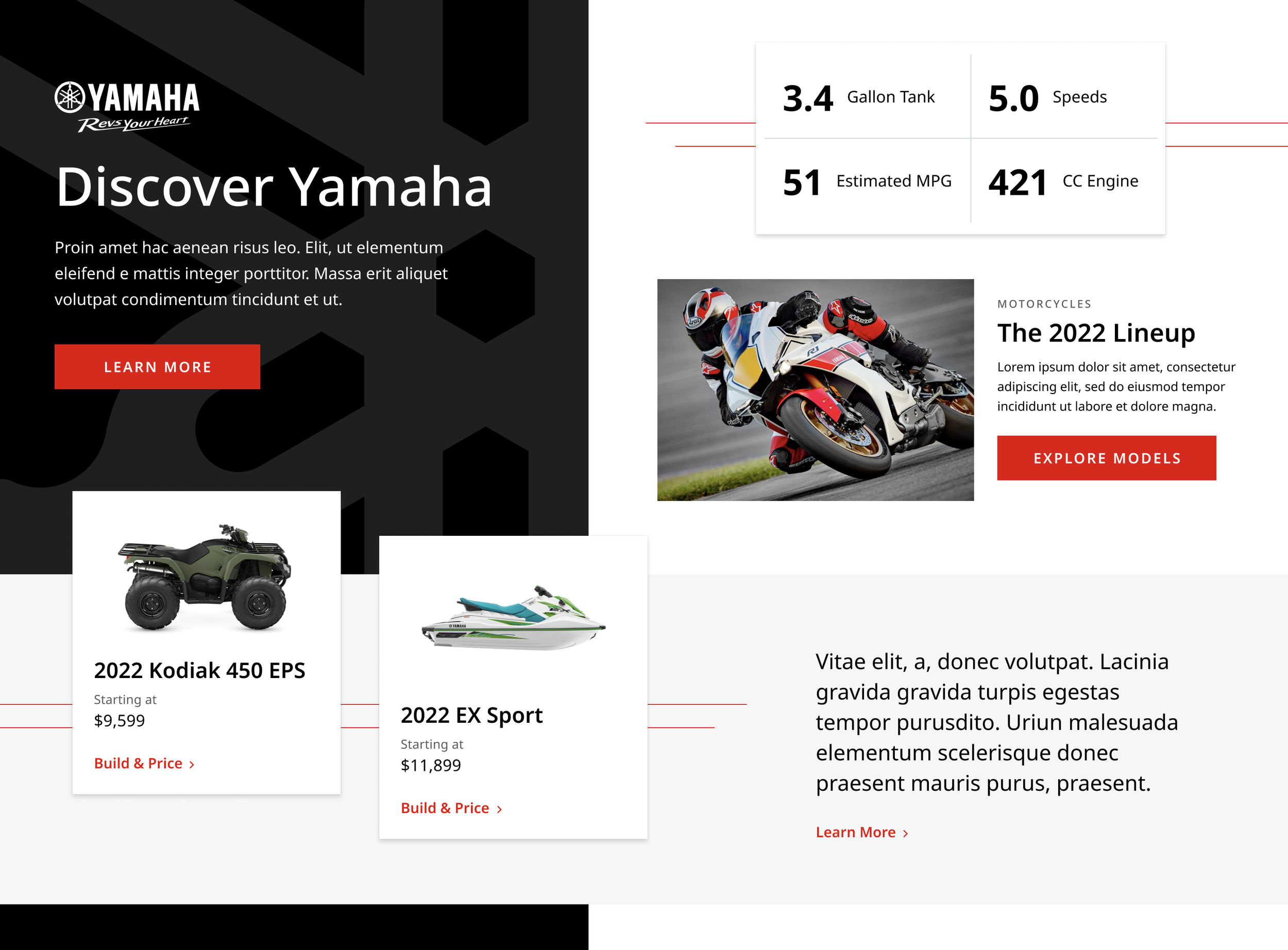
The Re-Design
The legacy homepage gave way to a concept organized around Yamaha's e-commerce priorities. Editorial photography, bold typography, and a structure built to inspire exploration rather than demand a search query.
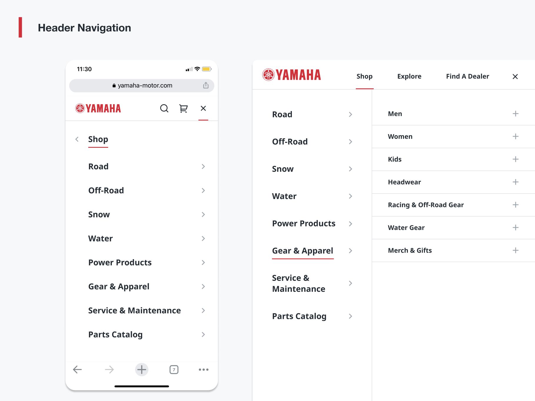
The Navigation
The navigation was restructured around how users actually think about Yamaha's products rather than how the business was internally organized. Product design and content strategy worked in tandem to test structure against real user mental models and build an IA that could accommodate all twelve business units without overwhelming anyone.
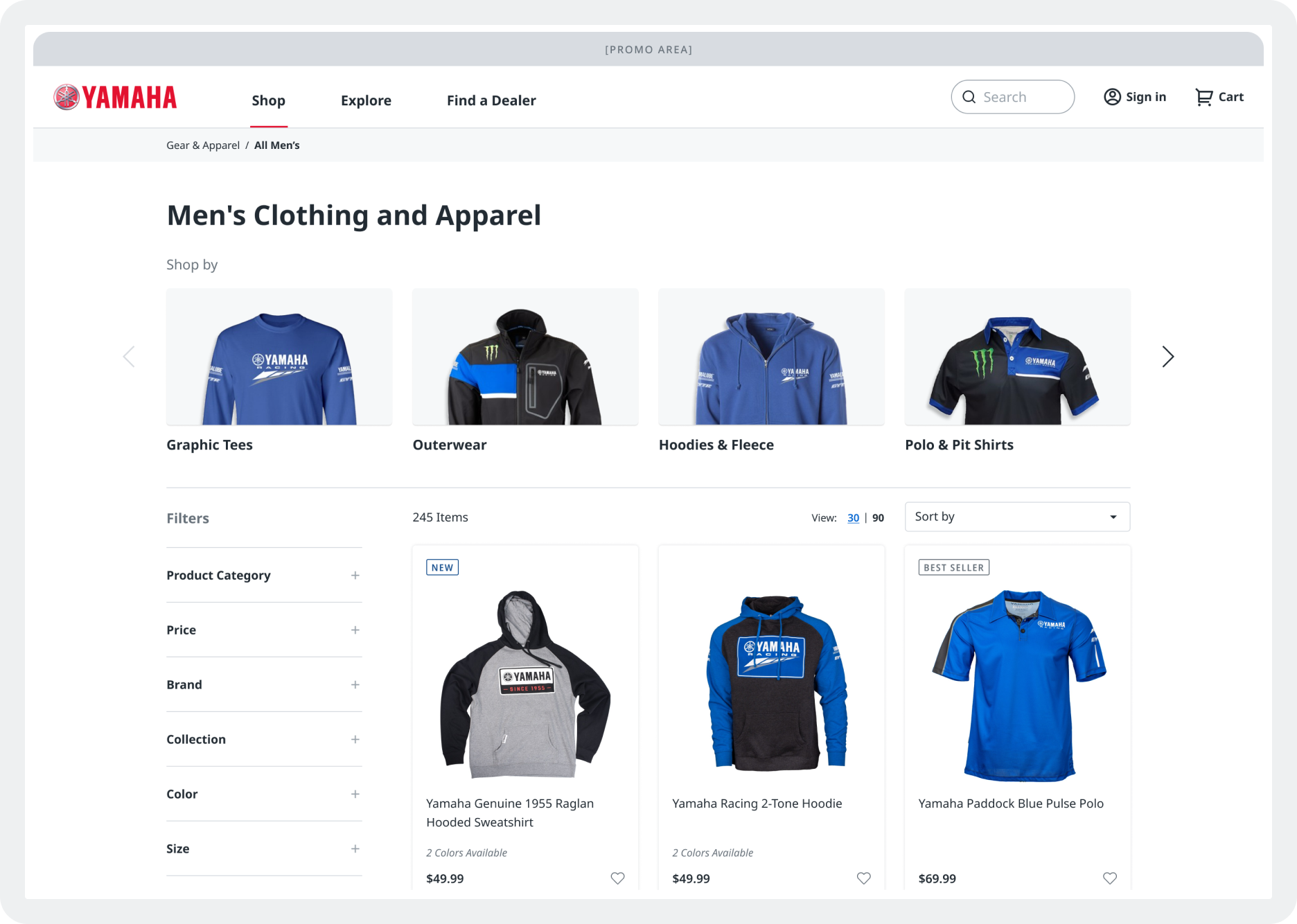
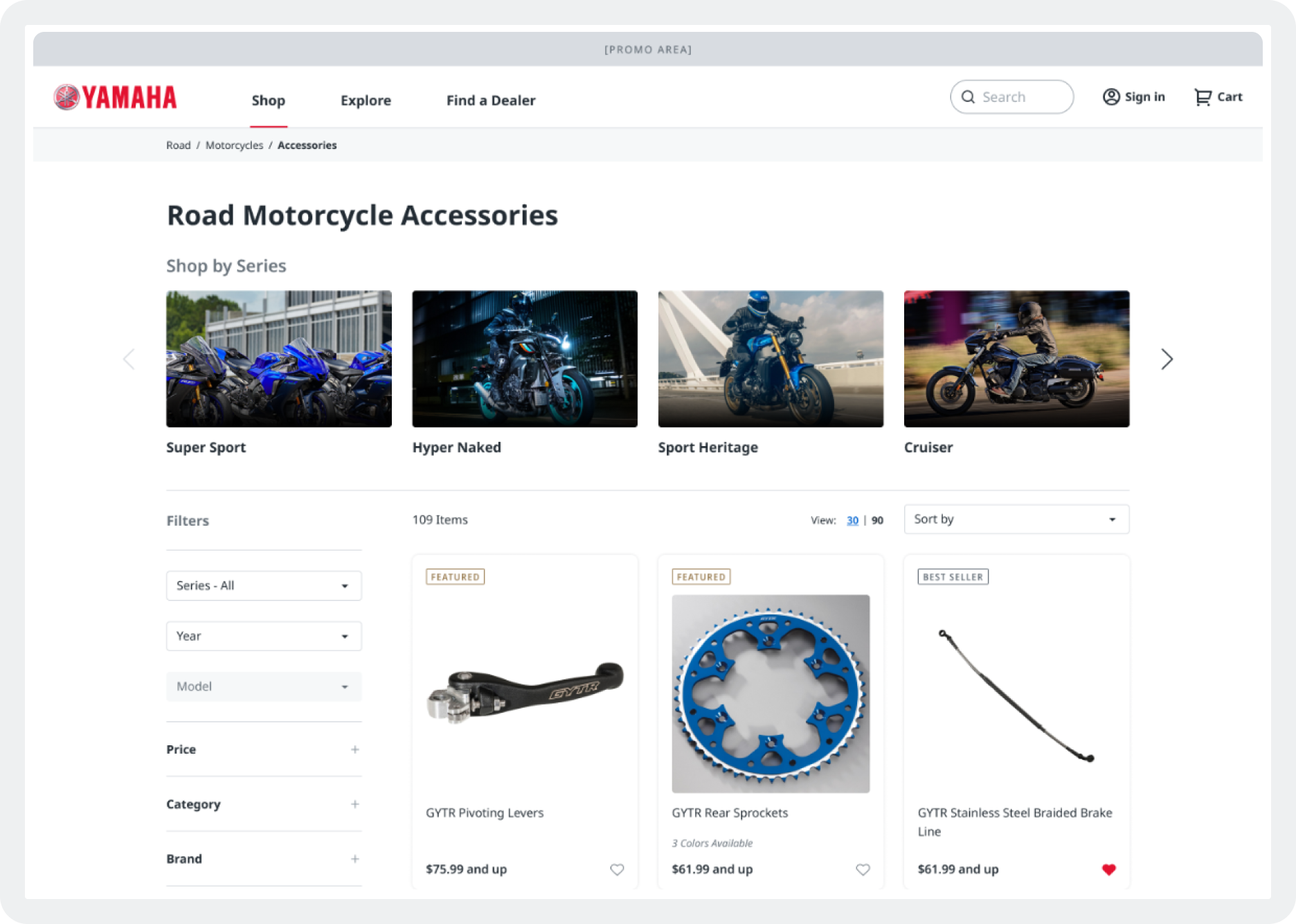
Product Pages
Product listing pages got filter taxonomies, sub-category browsing, and gridded components that made a catalog of thousands of items actually navigable.
The Parts Finder
Previously a painful zoom-and-scroll interaction on a static technical diagram that left users stuck on a wishlist with no way to buy. We rebuilt it into a modern mobile-first lookup experience where users could actually complete a purchase.
Legacy Parts Finder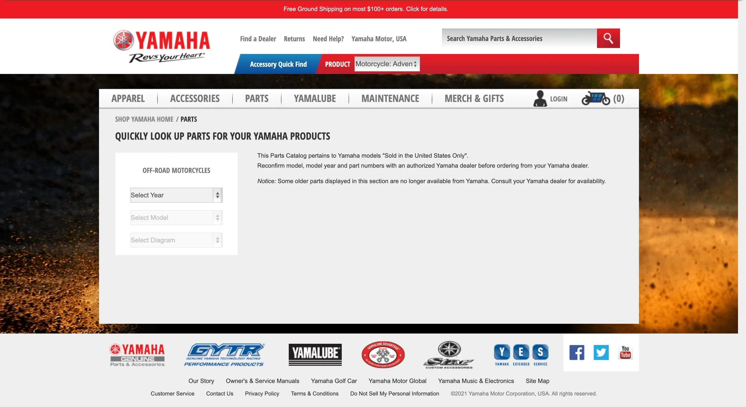
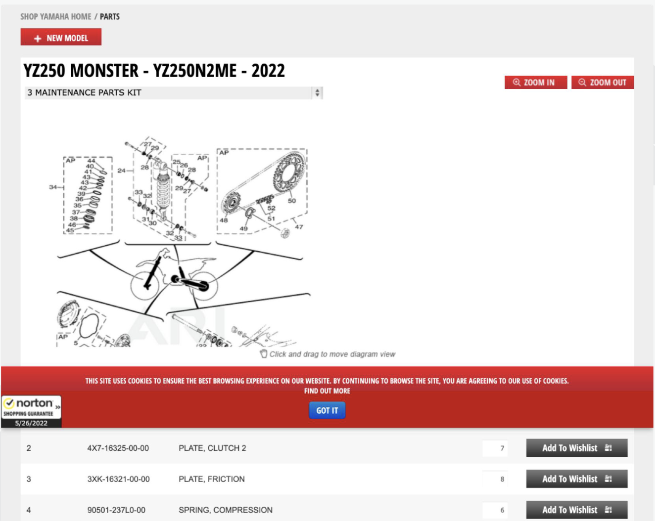
New Parts Finder
The Landing Page
With the system in place and the flows mapped, we moved into sprint-by-sprint design. Each two-week sprint tackled a specific feature or section of the site. I worked the same way as the other designers on the team, assigned to a feature and responsible for it end-to-end from competitive research through concept, iteration, prototype, annotation, and VQA
Legacy Landing Page
New Landing Page
The Details
Micro-interactions at checkout, such as animated progress bars, delivery method icons, and checkmarks that turn green upon a complete action, provided moments of delight across the frictionless experience. A curated photography system with a governance guide established how and when to apply BU-agnostic versus BU-specific imagery. Voice and messaging guidelines and signature animation patterns gave the experience emotional range beyond clean UI.
The Visual Quality Assurance (VQA) Process
Every section of the site had its user journey fully mapped before a single wireframe was drawn. Happy paths, error paths, edge cases, all documented and circulated with the client before we moved into design. That kept us from designing ourselves into corners and gave engineering a shared reference from day one.
The flows covered account creation, sign-in, search and filtering, parts lookup, and checkout. For navigation, the product design and content strategy teams worked together to test our structure against real user mental models and build an information architecture that could accommodate all twelve business units without overwhelming anyone landing on the site.
The Results
10%
increase in engagement
35%
increase in daily e-commerce users
10%
drop in bounce rate
The redesigned YamahaMotorSports.com launched with a unified experience across all twelve business units, built on a design system flexible enough to scale and a handoff process tight enough to ship at quality.
A year of work. More than 20 sprints. One system pulling it all together.