
Brand Identity and Site for an Early Stage AI Startup
A brand built from scratch. A new site in six weeks. Four new clients in three months.
The Brief
Skalr is an England-based, B2B AI startup that guides growth-stage European businesses in building predictable sales pipelines using AI automation and GTM strategy.
The two founders had a clear offering, as well as a couple of clients, but they lacked a visual identity and an online presence. They didn’t have established branding, a logo, or a website.
The Workshop
To ensure the site would deliver results, I highlighted the importance of establishing brand foundations before starting on the design. Strong brand guidelines and design system provide consistency for a business to build on and scale from.
With that agreed, I facilitated a remote brand alignment workshop with the two founders. One hour, five activities: brand heart, mission and vision mapping, personality and tone exercises, adjective voting, and a visual identity mood board.
The Logo
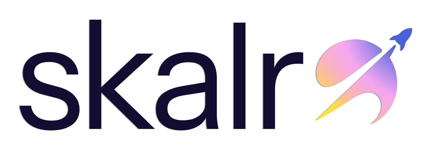
To begin, I presented five directions ranging from modular and structured to fluid and kinetic, each with a distinct personality and rationale. The founders identified what resonated, and from there, we nailed down a final direction together. The result was a clean lowercase wordmark paired with a custom rocket icon in a warm-to-cool gradient. The rocket ties to the name and the ambition. It holds up on light and dark backgrounds and scales well at every size.
Mild to Wild Scale of Early ExplorationsFinal Version of the Skalr LogoThe Design System
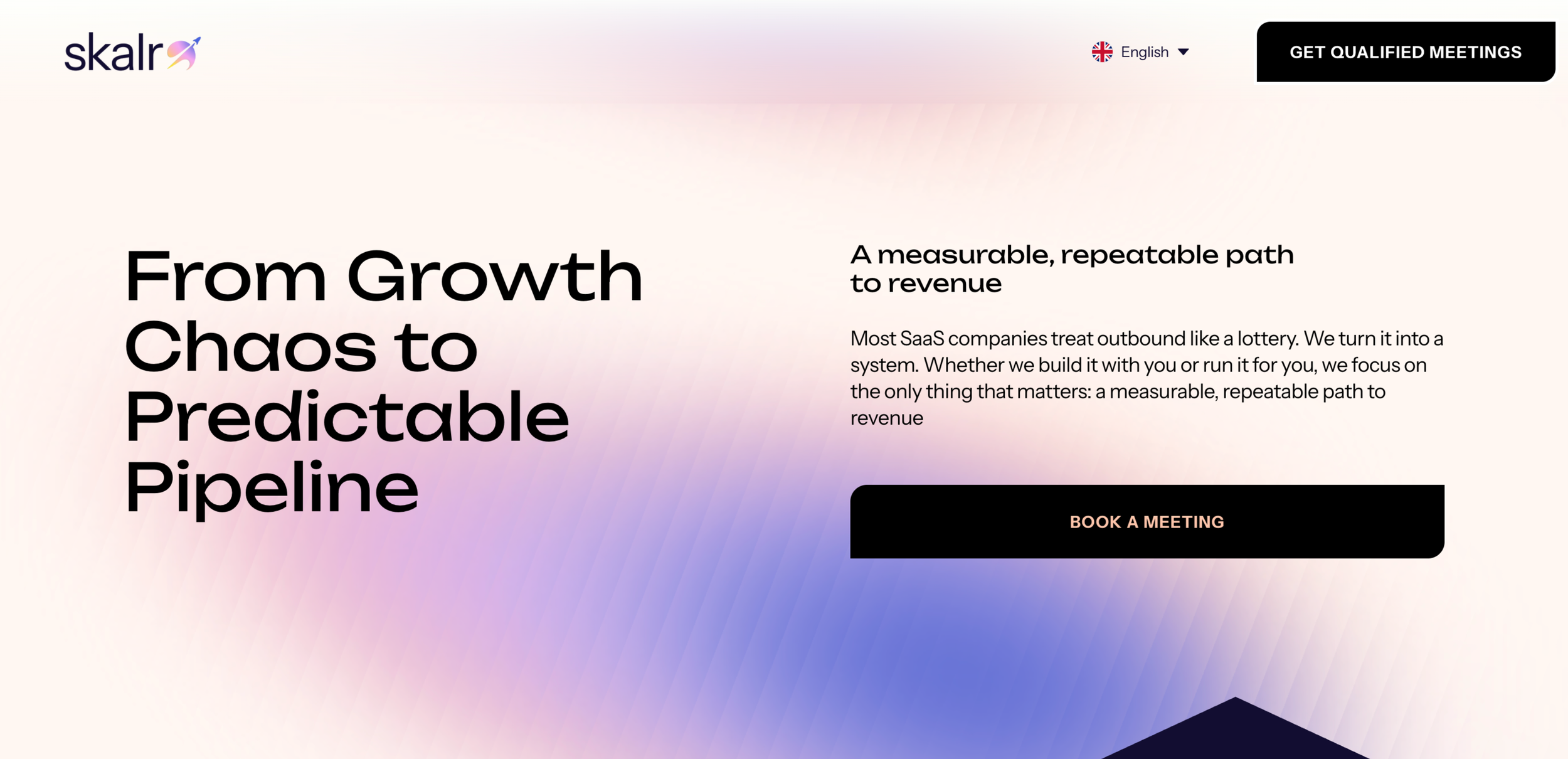
With the logo confirmed, I created a foundational design system in Figma that I would later implement as the “system styles” in Squarespace. Colors, typography, vector illustrations, iconography, and infographics. The primary cool blues grounded the B2B credibility they needed. The secondary warm pinks and gradient brought in the human, approachable side that kept coming up in the workshop. Unbounded for headlines, Instrument Sans for body.
The system was scoped for a startup needing consistency and speed, not over-engineering.
The Website
I did end-to-end design and building of the site on Squarespace, working directly with the founders on content and making sure every design decision connected back to their needs.
The visual language was intentional from the ground up. Upward angles divide sections to create a literal sense of forward momentum. Half circles peek up at the bottom of sections as you scroll, hinting at what is coming and reinforcing the idea of growth and things on the horizon.
The shape choices, the color application, and the moments of playfulness throughout were all grounded in design psychology, creating an experience that feels alive and directional without getting in the way.
The Result
The site launched on January 1 as planned. Within three months, Skalr had acquired four new clients directly through the site. For a two-person startup building from the ground up, that's a meaningful outcome and one that started with getting the brand foundation set before building on top of it.