
Designing a brand new world from scratch.
Every app you've ever used ran on someone else's servers. Reality wanted to change that. The idea is that your laptop, your phone, any of your devices, really, can be the infrastructure. No AWS. No Google Cloud. A network owned by the people.
The design challenge was two-pronged: making a company website for investors to learn more and working on the actual software design, specifically the onboarding experience, focusing on designing for someone encountering this type of technology for the first time, without losing the people who already understood it and just wanted to get started.
The brief was a landing page and an app onboarding flow. The real problem was harder than that.
The Scope
This was a freelance engagement where I was the only product designer, working directly with the CEO, the head of marketing, and a backend engineer.
I ran two workstreams in parallel: designing and launching the company landing page at reality.xyz and designing the onboarding experience of the Portal app, which is the entry point where users manage their wallet, run a node, and decide which apps their device powers.
The challenge was the variation in platforms and audiences, but the design system I built would help hold it all together.
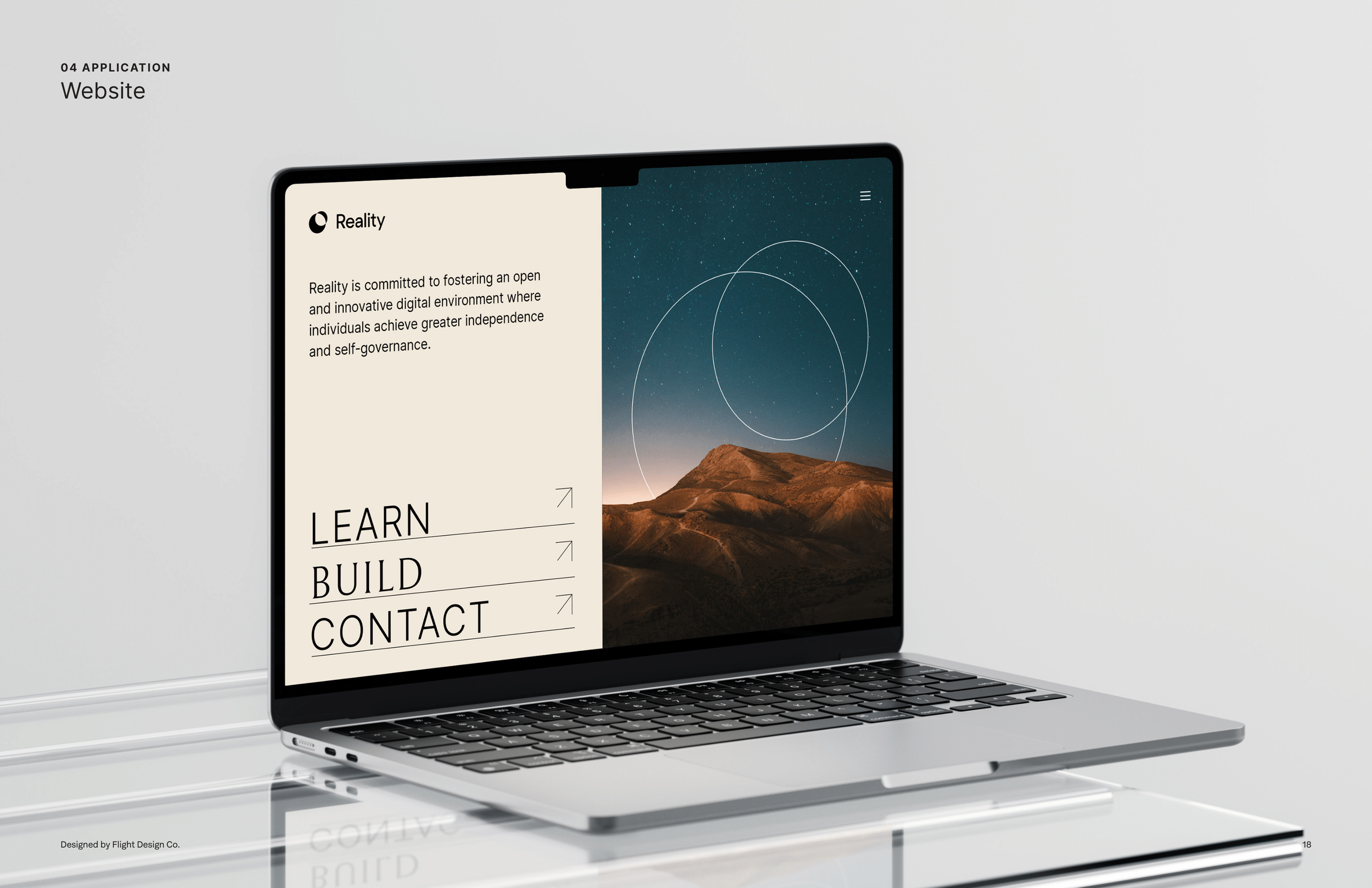
Final Web Designs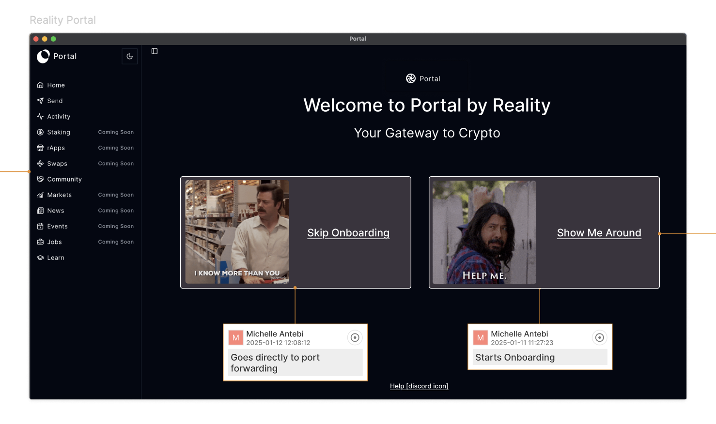
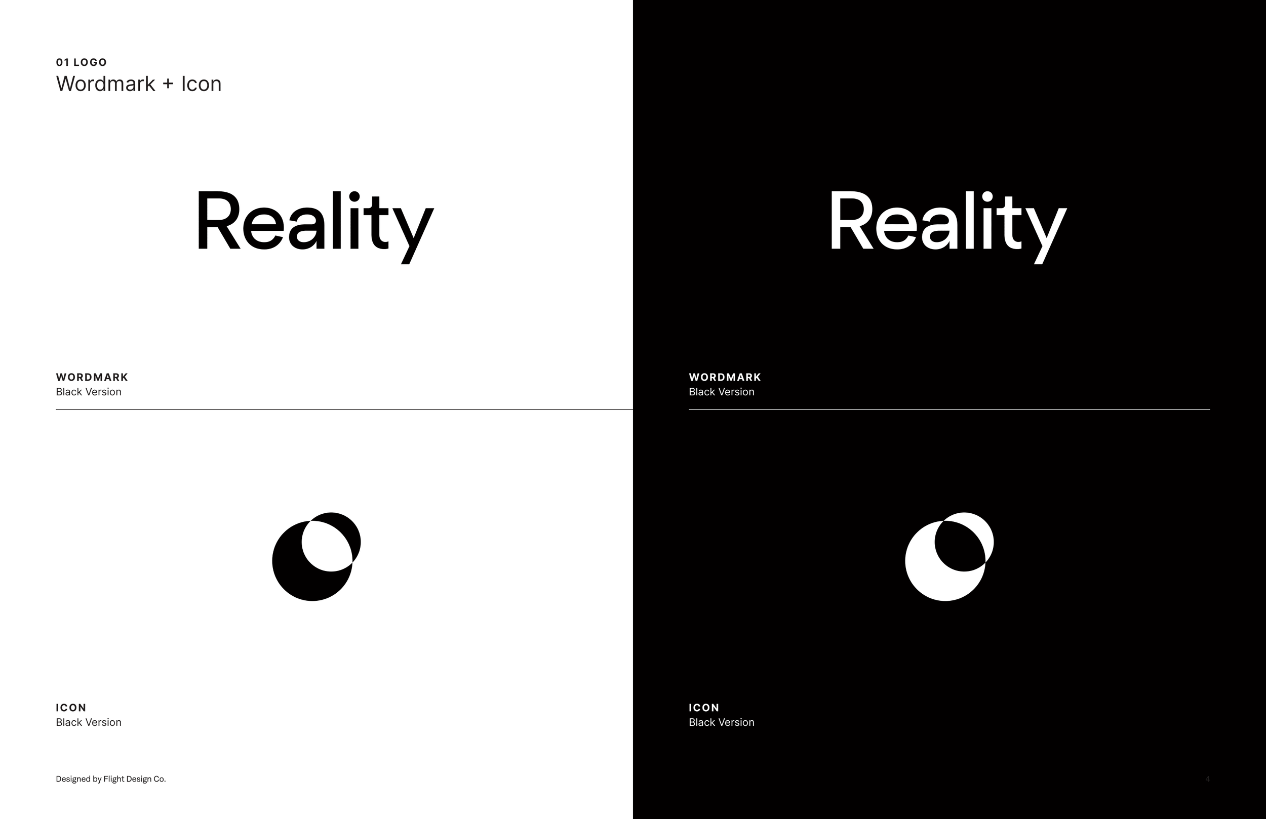
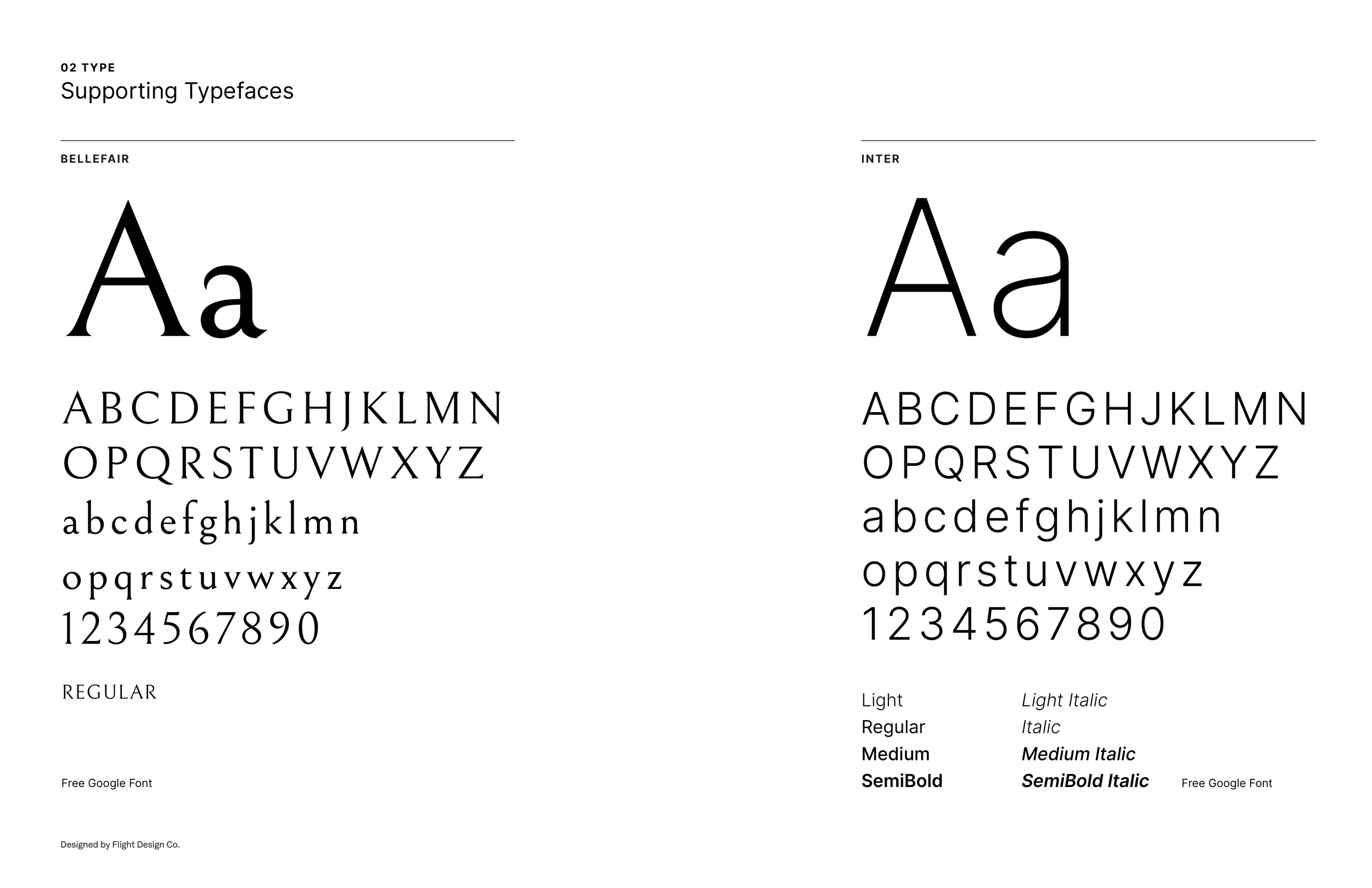
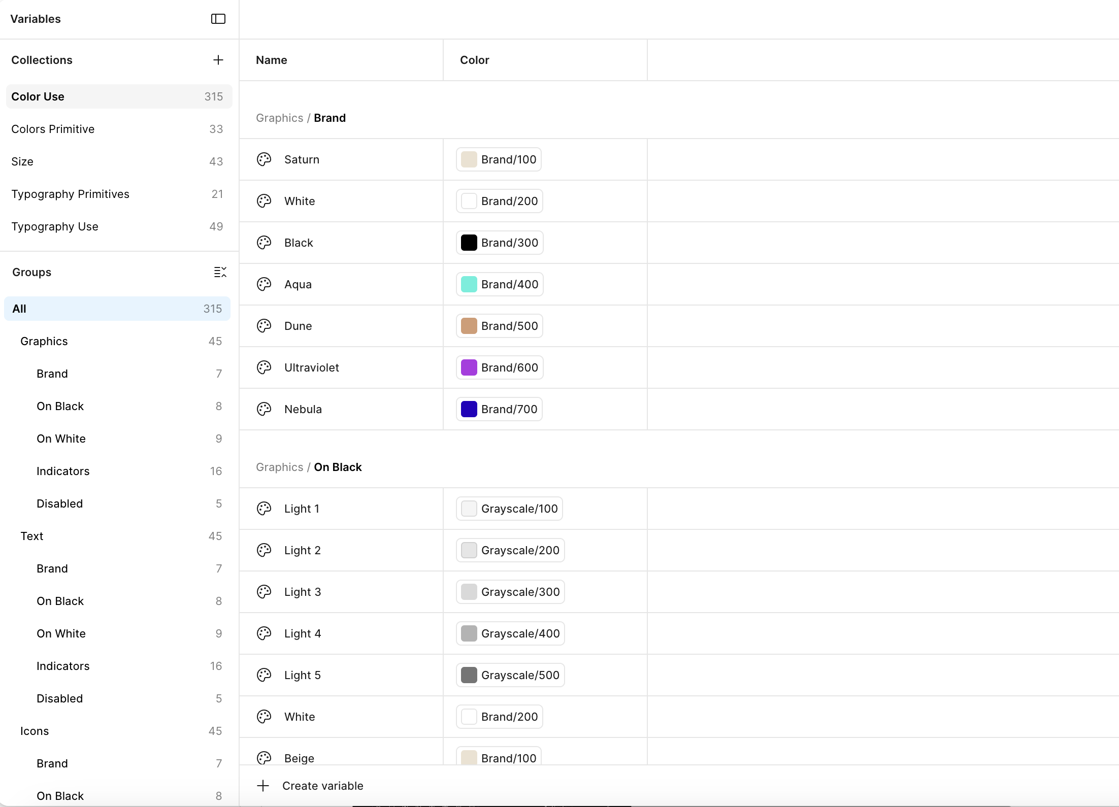
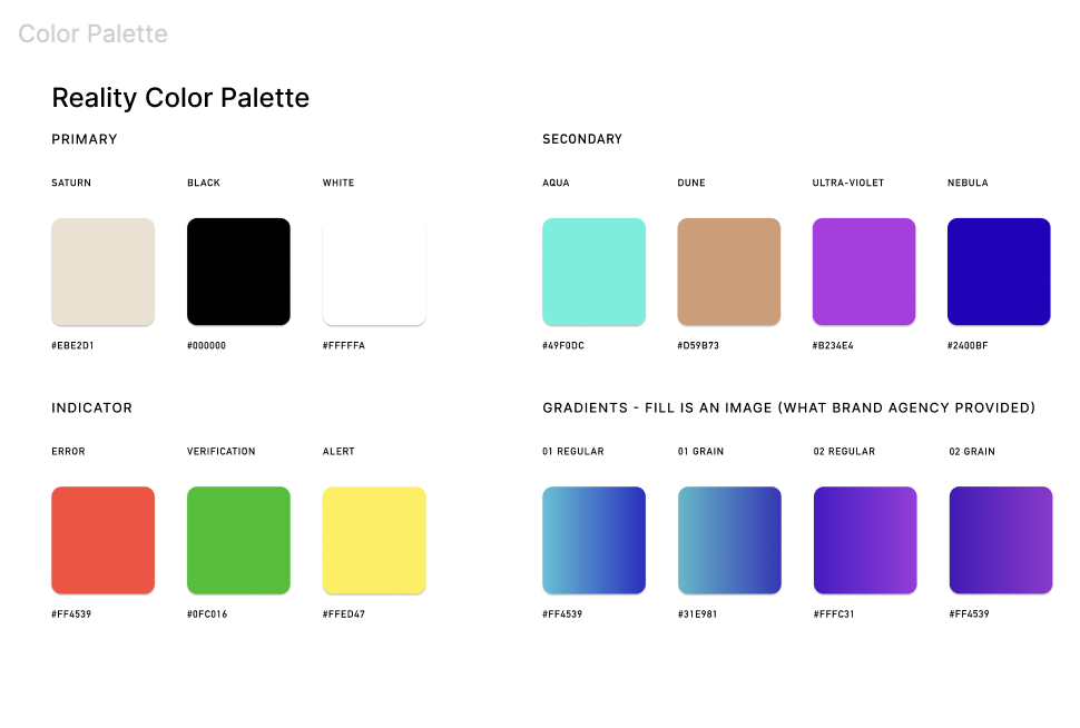
Portal OnboardingA branding agency had produced a strong visual identity: a palette of Saturn, Aqua, Dune, Ultraviolet, and Nebula, Bellefair for display headers, Inter for everything else, and a logo system with real intention behind it. My job was to translate that into something a product could actually be built on, meaning a design system.
Brand Foundations
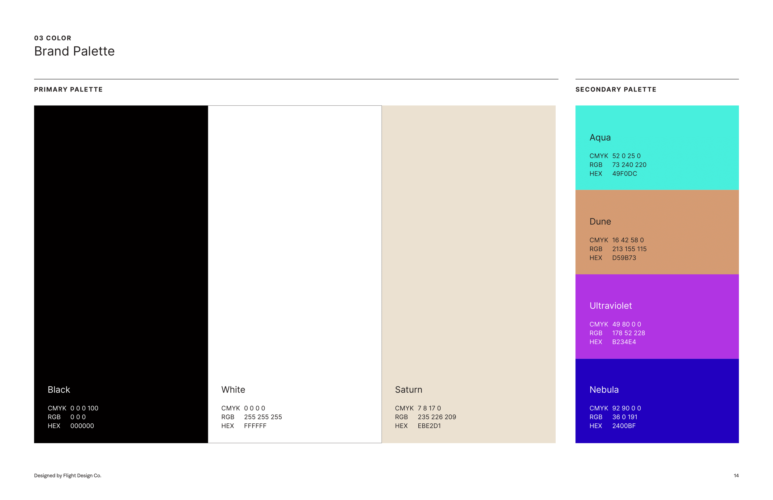
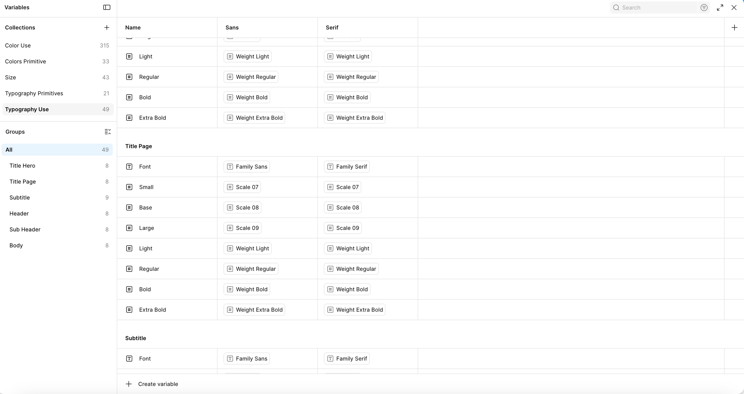
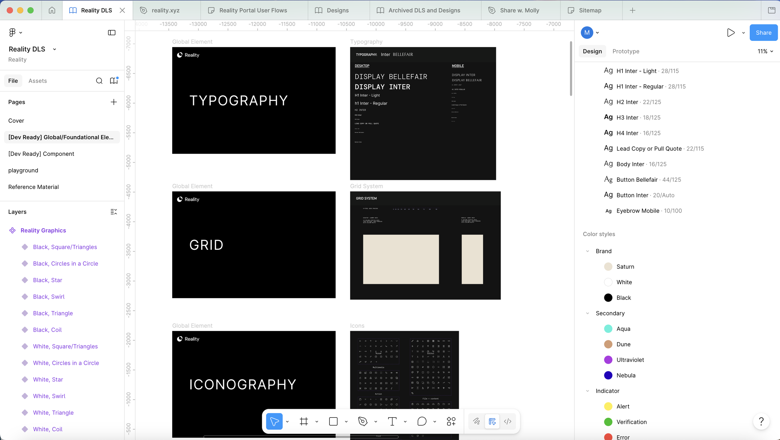
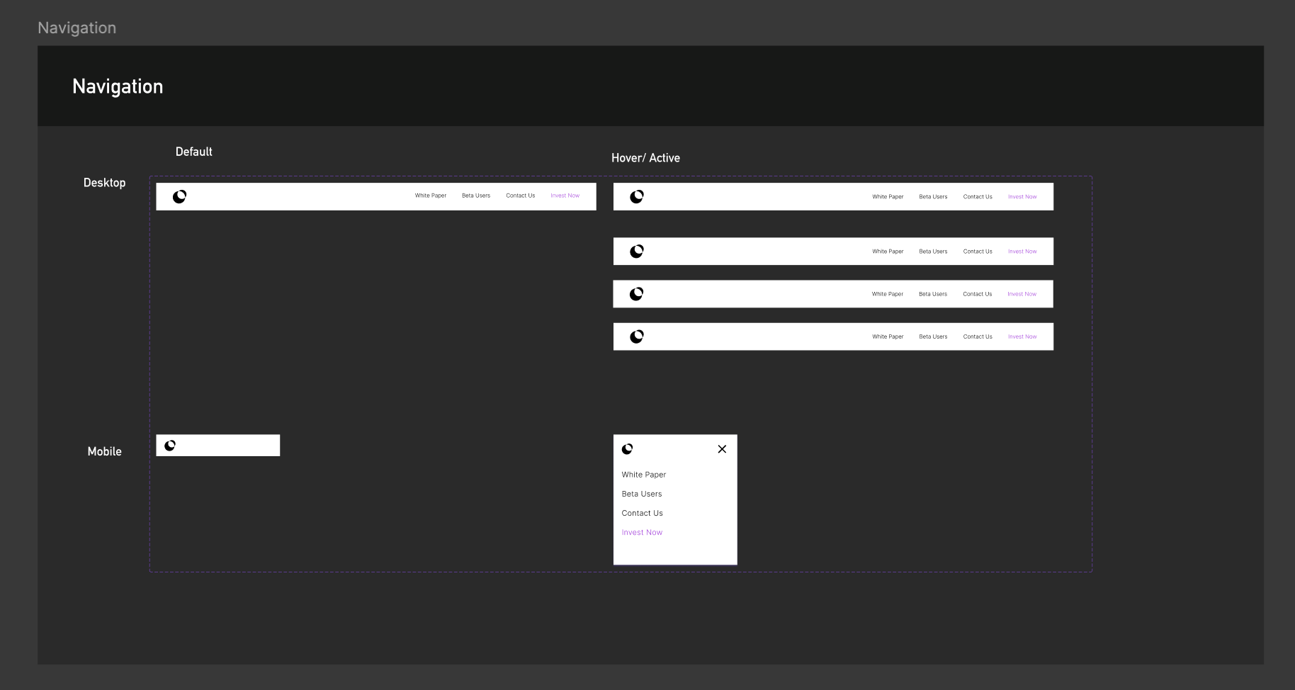
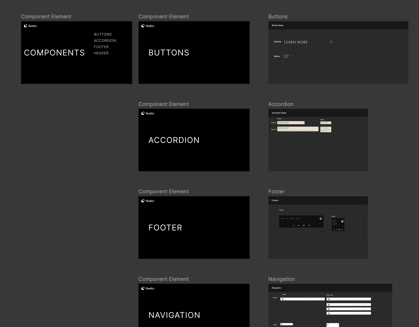
With Figma, I built the design system from scratch, resulting in 315 color variables, 49 typography variables, and tokens and components to cover every essential MVP moment: buttons, accordions, footers, and navigation, all built for desktop and mobile. The system had to stretch across a brutalist marketing page and a dense dApp interface without either one drifting from the other. Getting the architecture right first meant every decision downstream had somewhere to land.
A Systematic Build
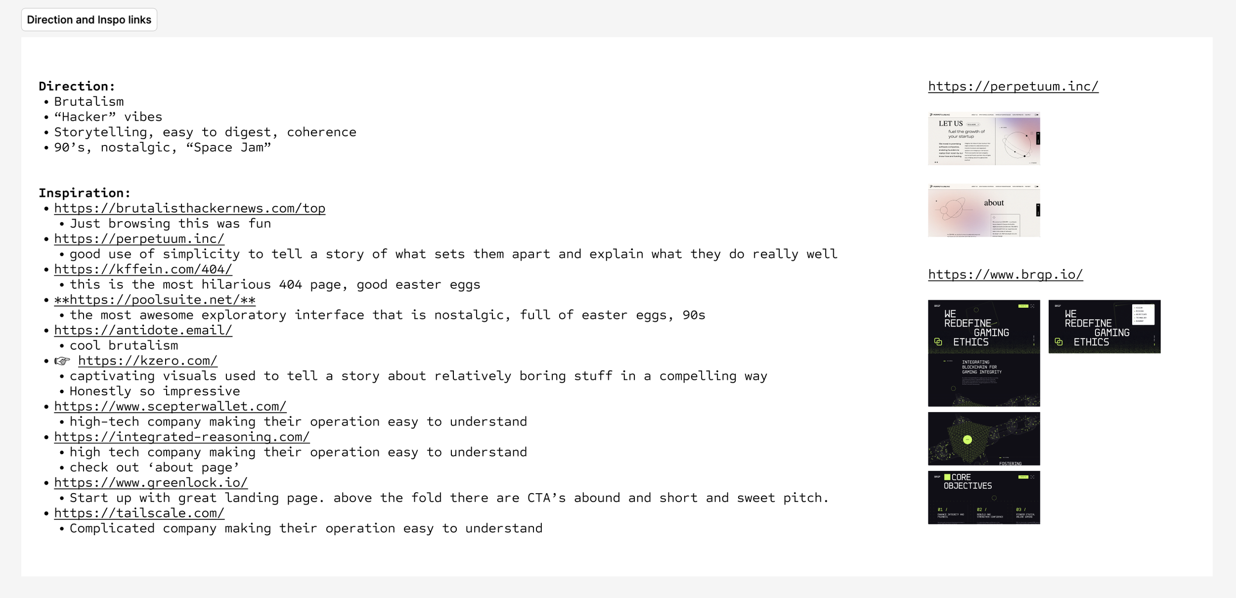
The design direction was clear before a single frame existed. The CEO had a strong point of view: brutalist, hacker energy, 90s nostalgia. Sites like poolsuite.net, kzero.com, perpetuum.inc, and brgp.io showed what was possible when the design committed to an immersive visual world. The goal wasn't just to make the technology digestible. It was to create something that pulled both newcomers and experts into a world they actually wanted to be part of.
When the Product Is Hard to Explain
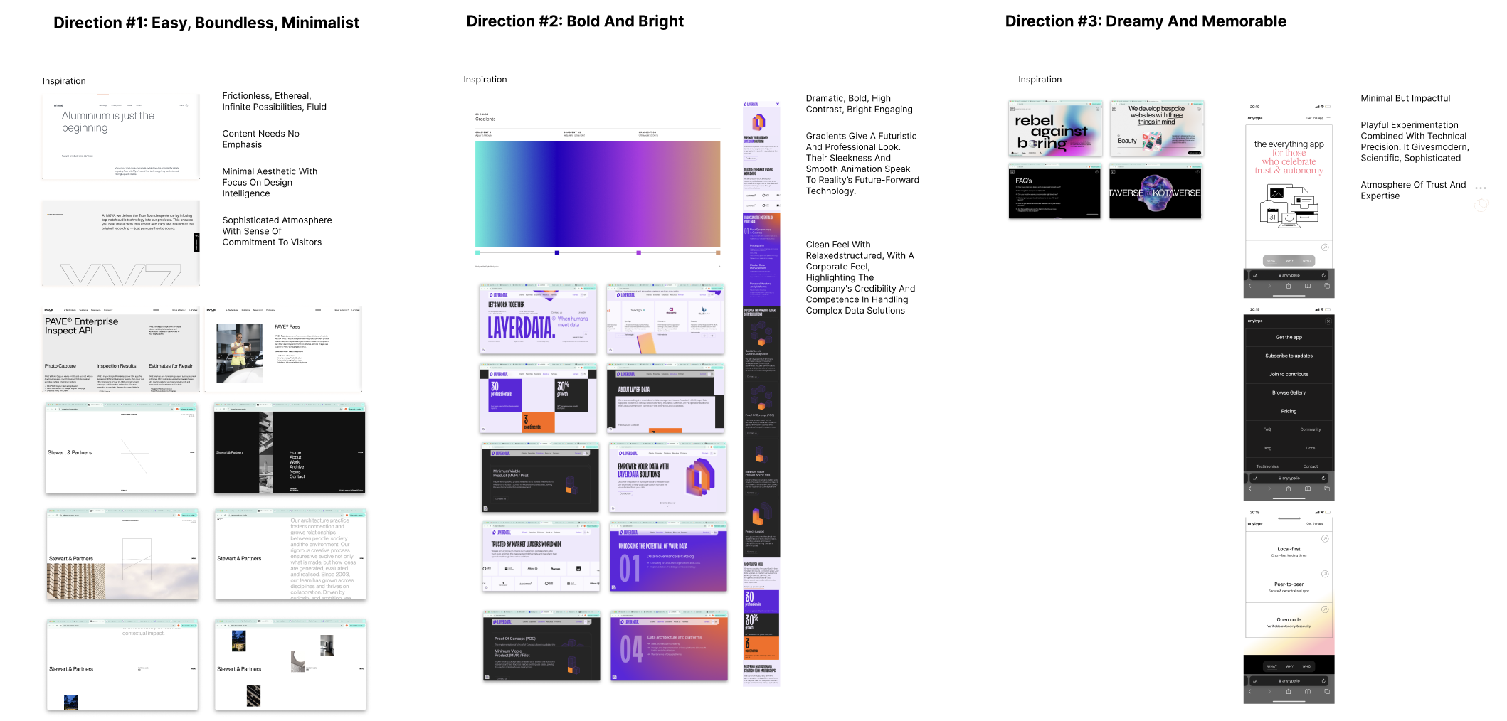
Before any design work began, I presented three distinct directions to align the team on a visual approach. 1: Easy, Boundless, Minimalist. 2: Bold and Bright. 3: Dreamy and Memorable. While we didn’t land on a single direction, the exercise was useful because we ended up using a mix of Boundless, Bold, and Memorable.
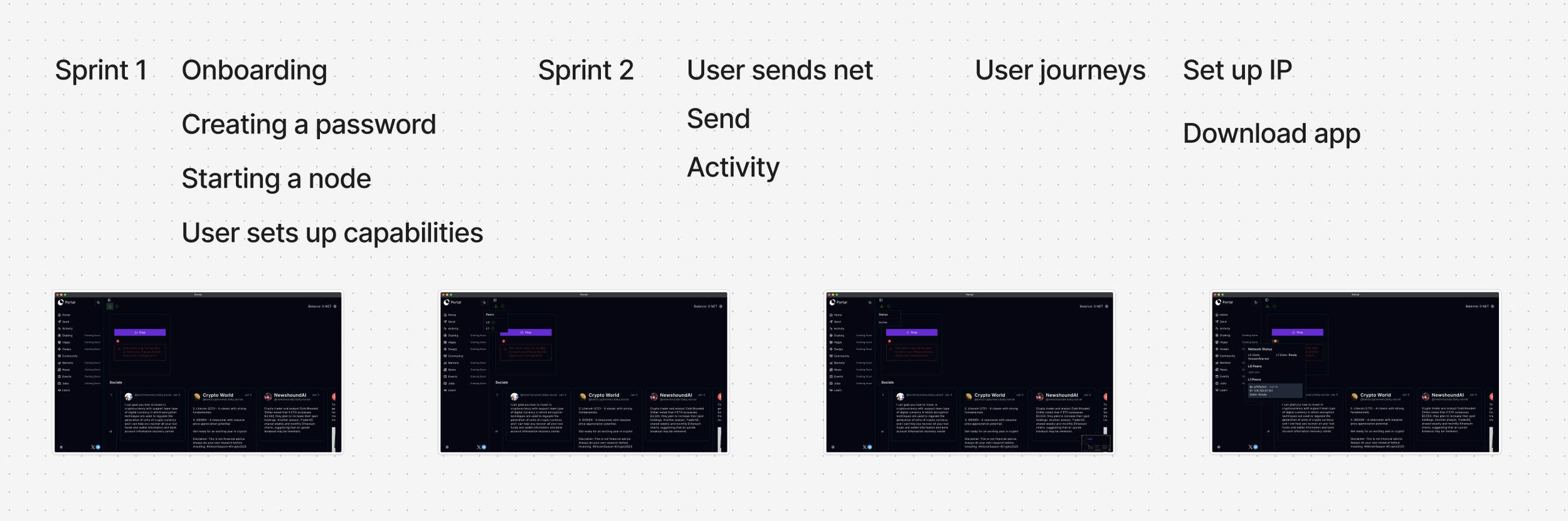
Iterating
Getting to the final design took six versions:
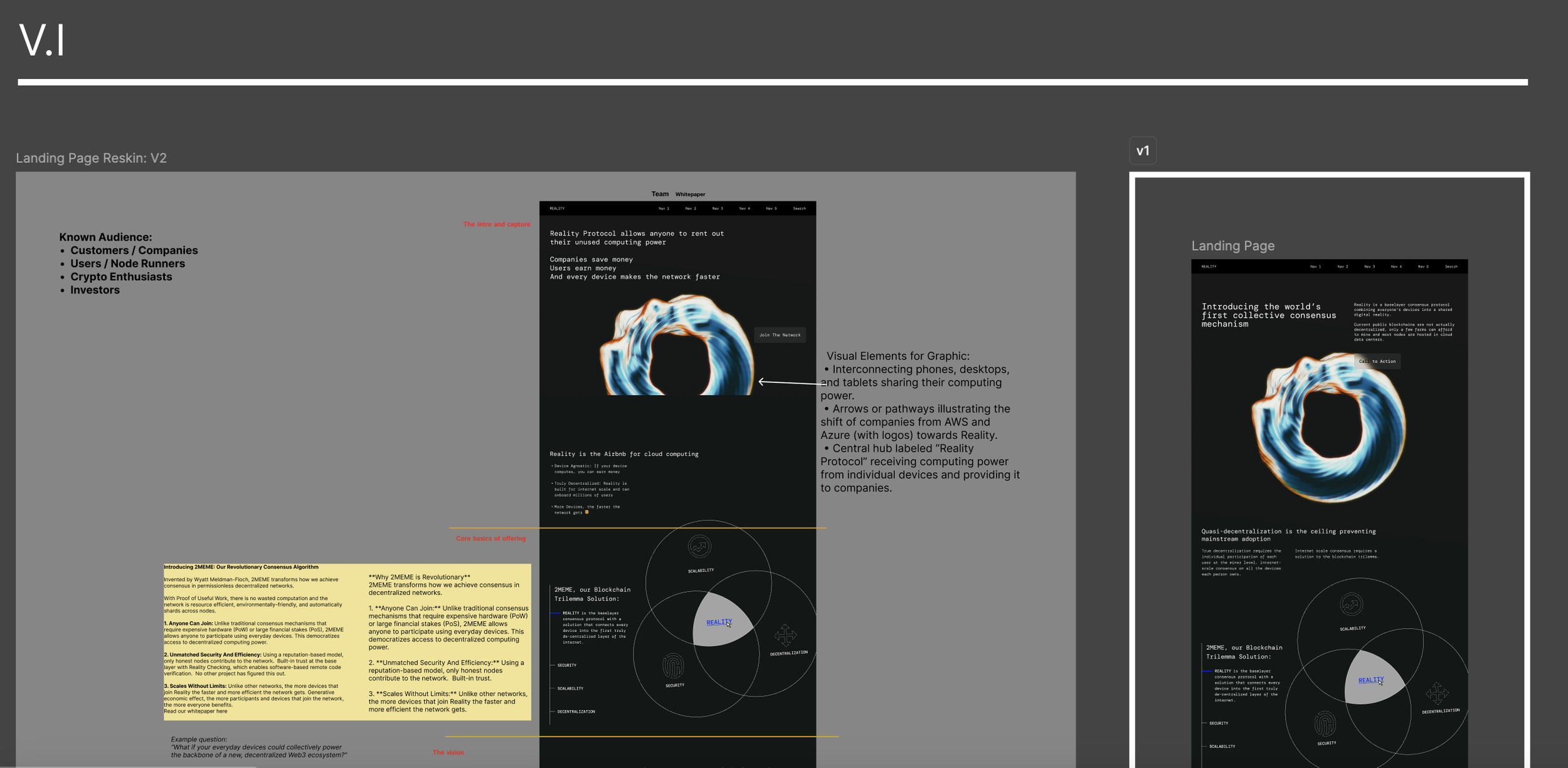
V1 was a reskin, still figuring out the audience and the visual language.
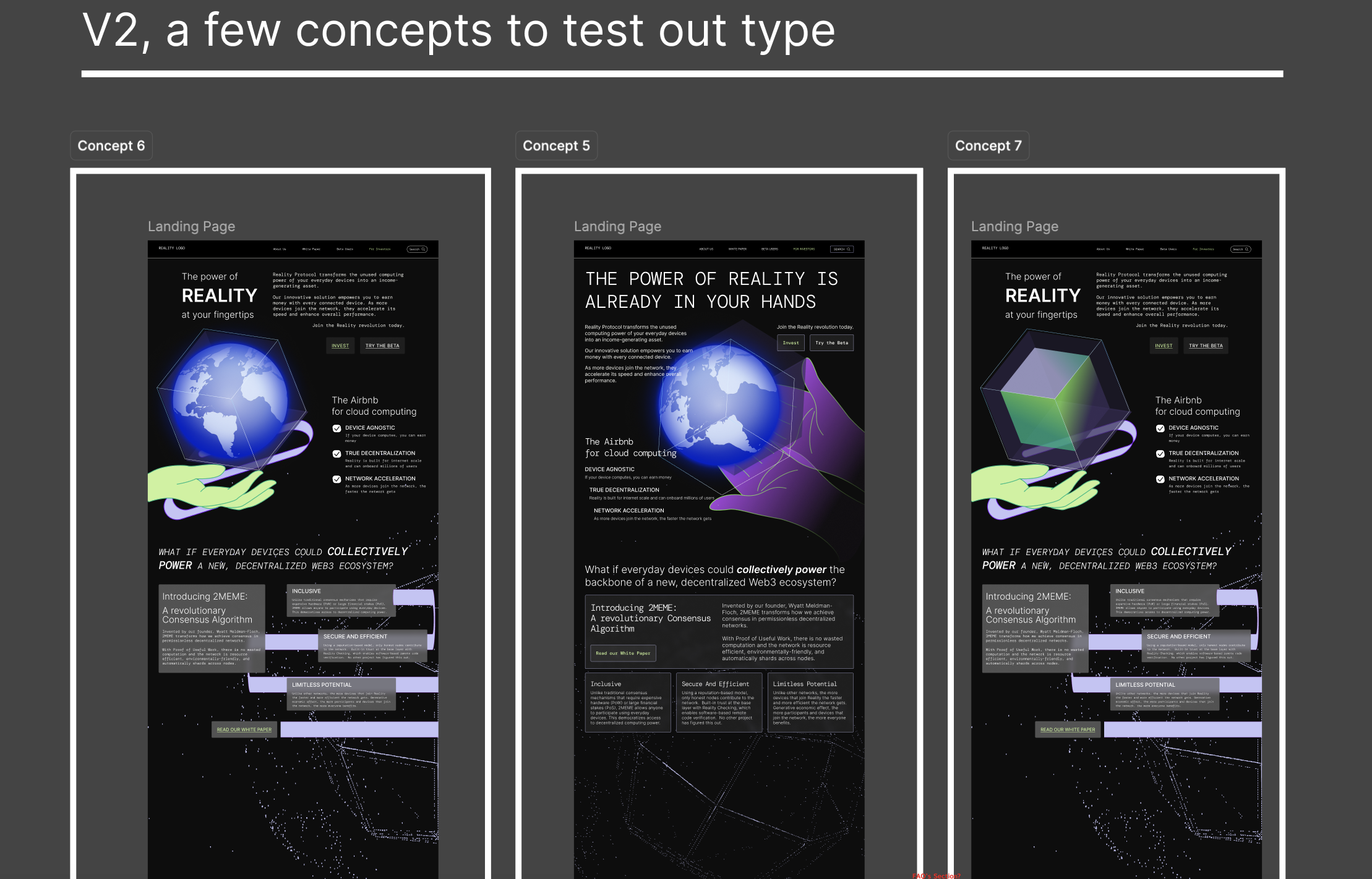
V2 tested three concepts in parallel to find the right typographic direction.
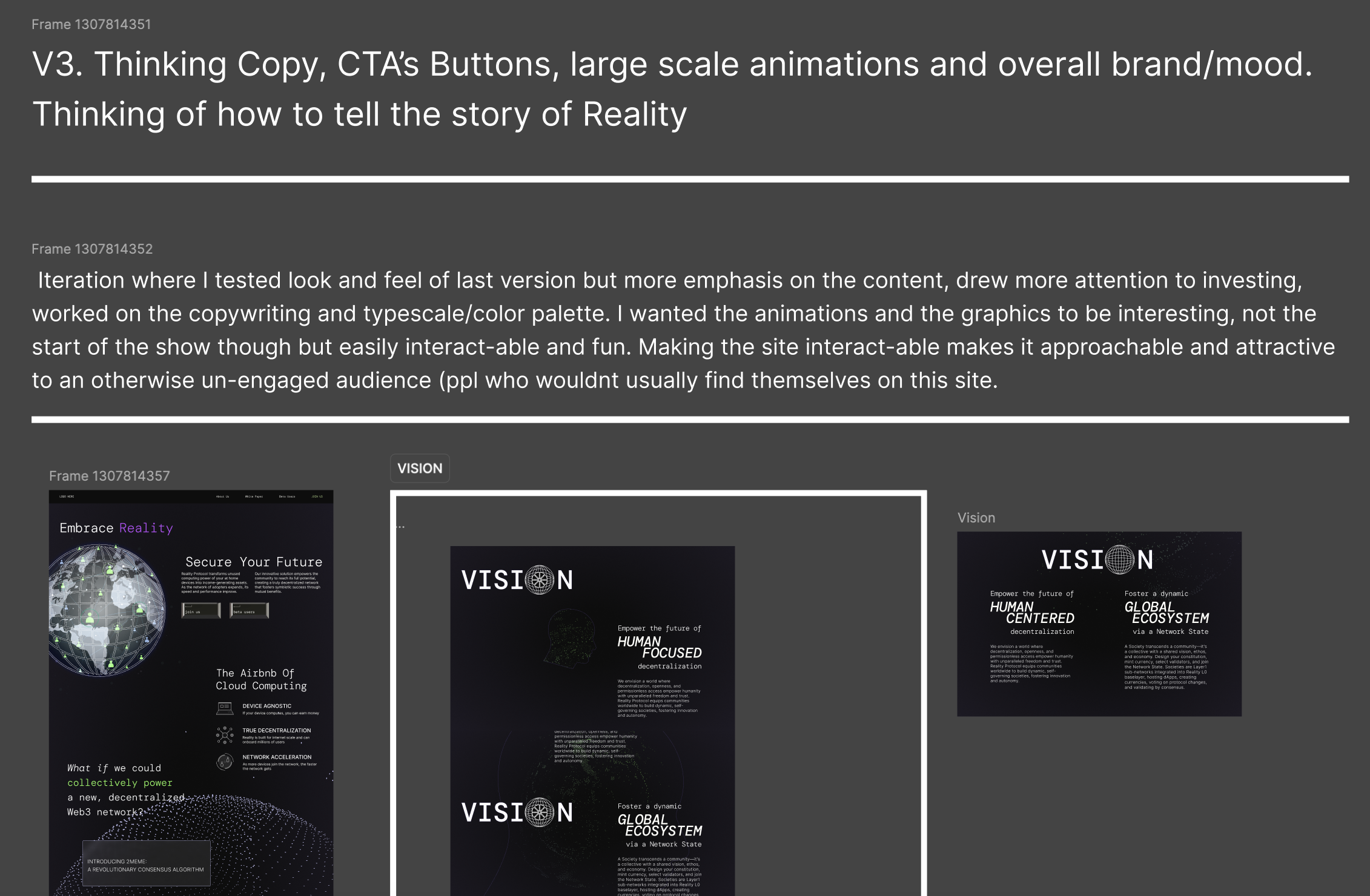
V3 was where the mood locked in, old school yet futuristic, graphics serving the content without competing with it.
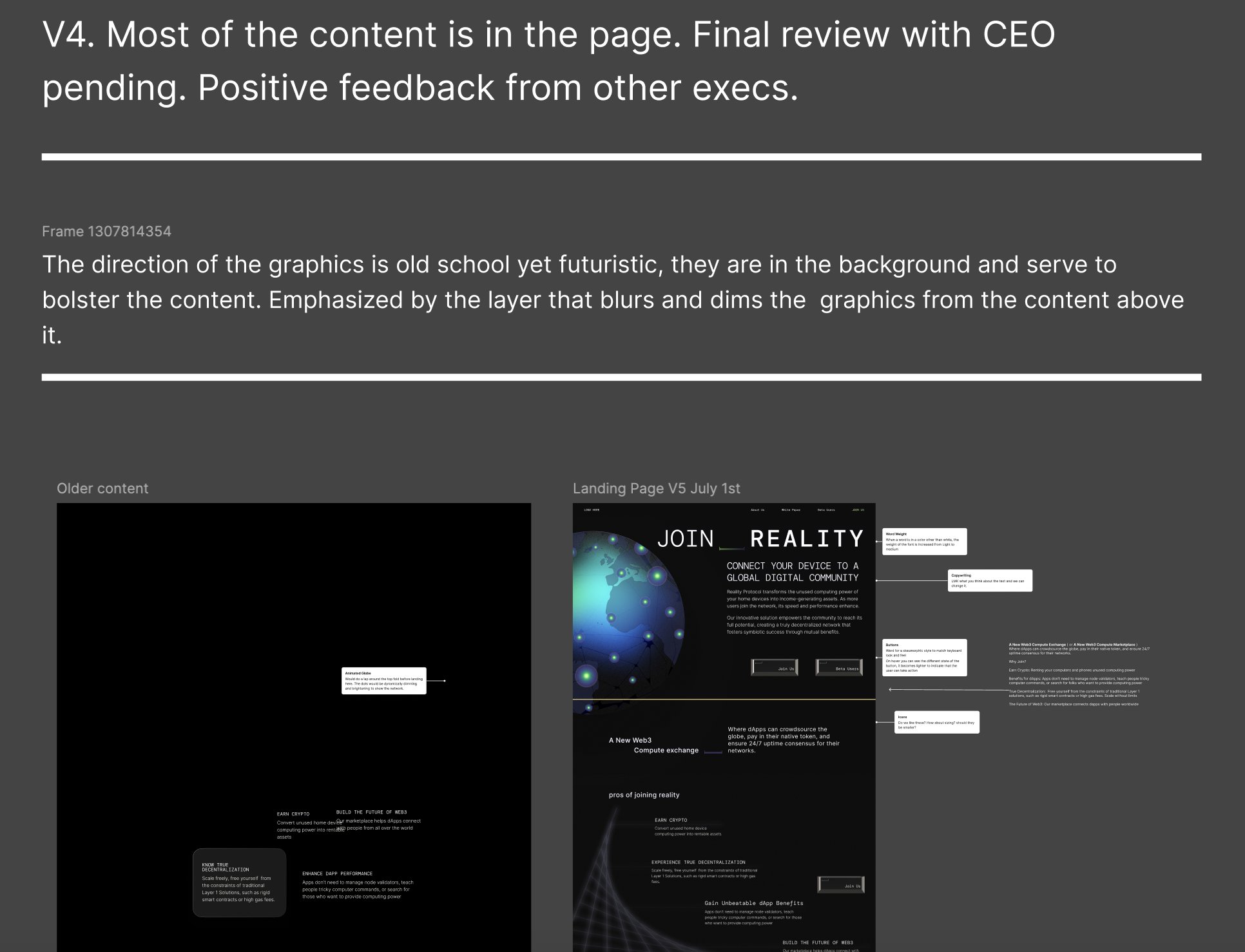
V4 brought in the full content with positive feedback from the team.
V5 incorporated mobile and iterated on the hero globe graphic.
V6 tested layout, animation amounts, and added new content sections.
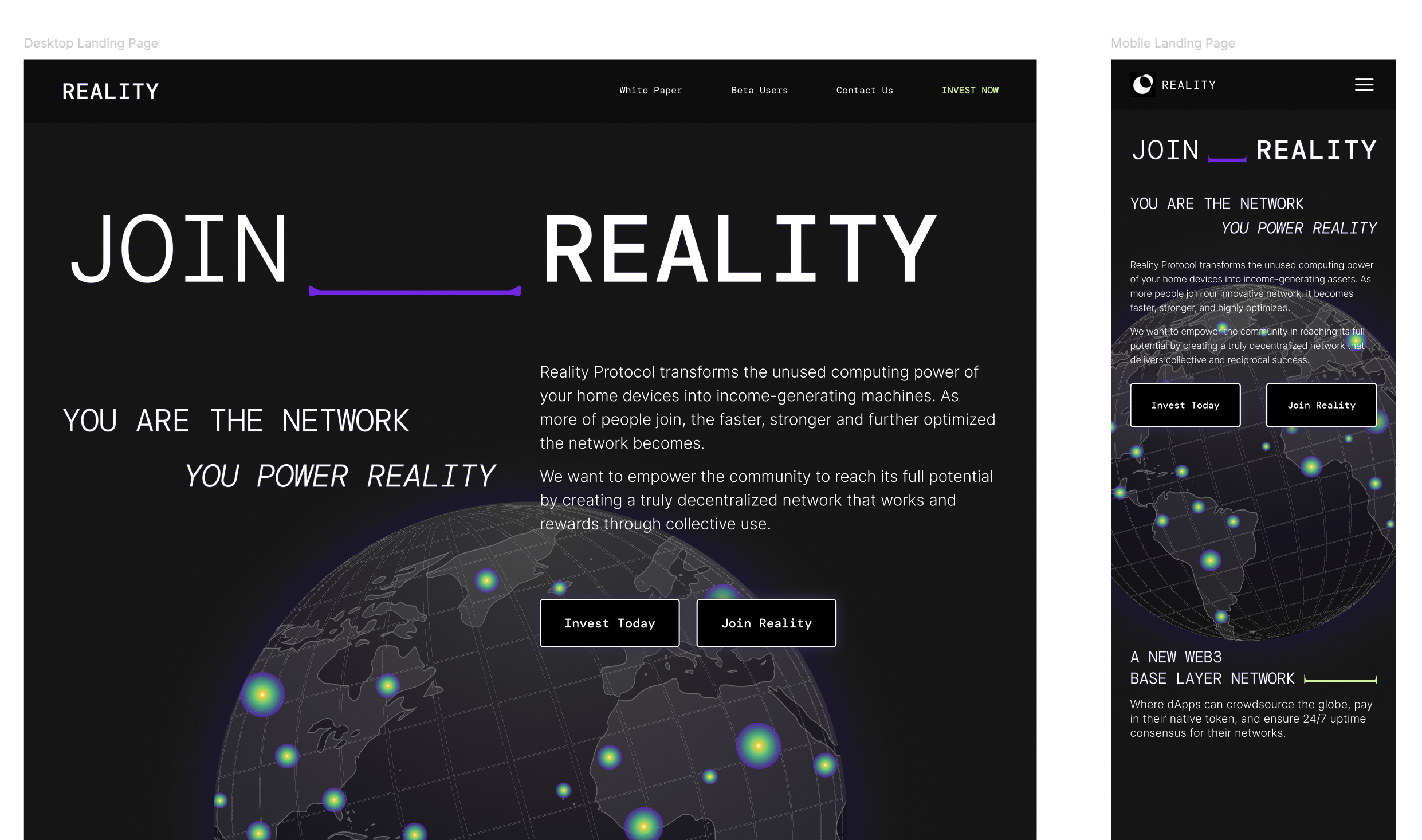
Final Web Designs
I worked with the CEO and head of marketing to shape the copy alongside the design. The hierarchy of information was crucial: you are the network, you power reality. The technology is the point, but the feeling had to land first. The page moves from identity to mechanics to vision to FAQs, giving every type of visitor somewhere to go deeper without losing the one who just arrived.
The sitemap told the same story in structure. The existing site had five nav items and no real information architecture underneath them. The future state expanded that into a full taxonomy covering Technology, Community, About, For Investors, Get in Touch, and Support, built to grow with the product instead of cap it.
My final MVP design, the 2024 launch, and today. The foundation held, and the system scaled.
Final Design
2024 LaunchToday

The Reality Portal
The website is a great marketing tool but the Portal app is how users actually enter the Reality Network. It is where new users activate their account, configure their device as a node, manage their wallet, and choose which rApps their device powers. Getting someone from download to active node was the core activation problem, and it was made significantly harder by the fact that the user base split into two groups with almost nothing in common.
One user already understood the technology. They knew what a node was, had likely run one before, and wanted to get started without being walked through concepts they didn't need. The other user was encountering this type of product for the first time. They needed context, reassurance, and a clear mental model before they would trust the app with their device. Designing a single onboarding flow that served both without alienating either was the UX focus.
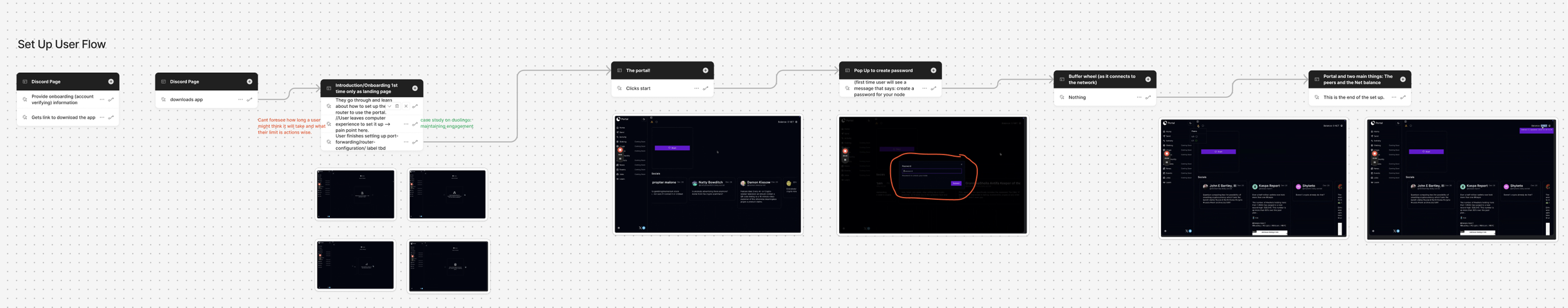
Mapping the Flows
I mapped both user journeys with the CEO and head of marketing, defining the key activation moments for each persona and where the paths diverged. The critical insight was that the divergence had to happen on the very first screen, before any cognitive load had accumulated. Asking users to self-identify mid-flow would have created friction for both groups.
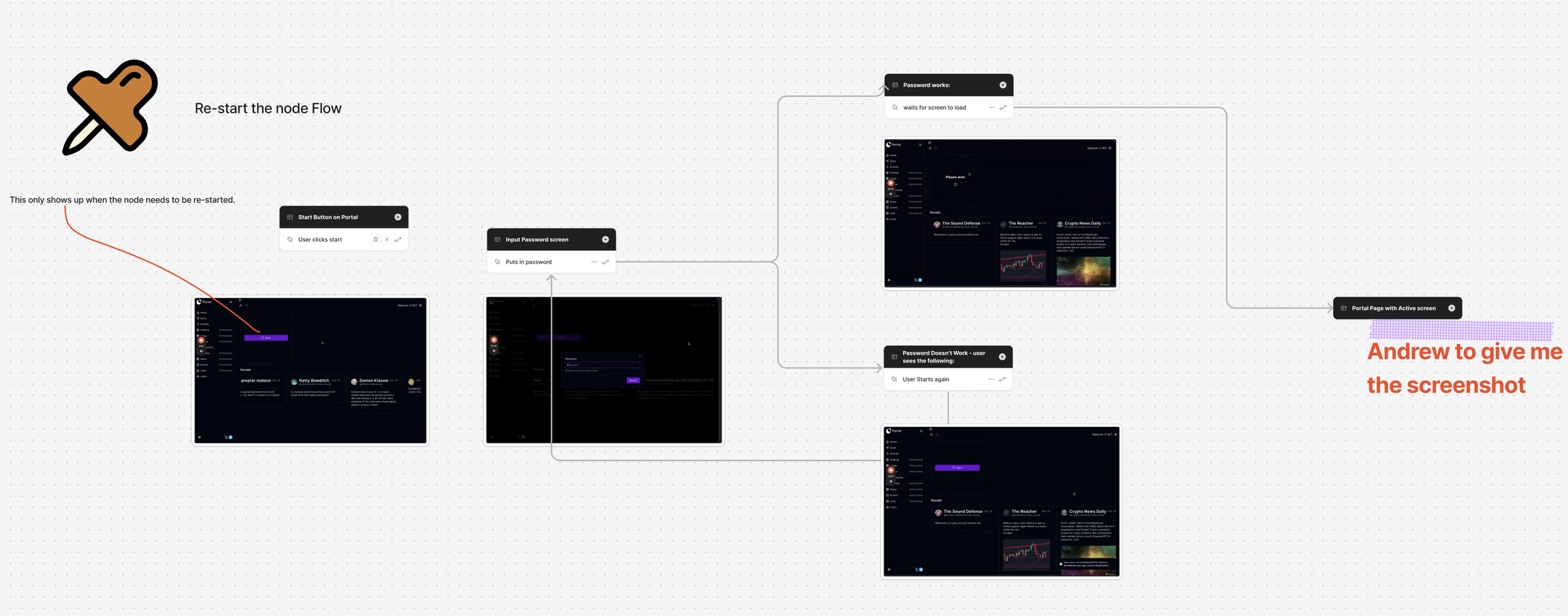
To pressure test the novice flow, I onboarded myself to the platform with help from a Reality expert. The barriers I hit directly shaped the flows I mapped. Port forwarding, password creation, and node configuration each carry real drop-off risk if the design doesn't anticipate confusion points early on.
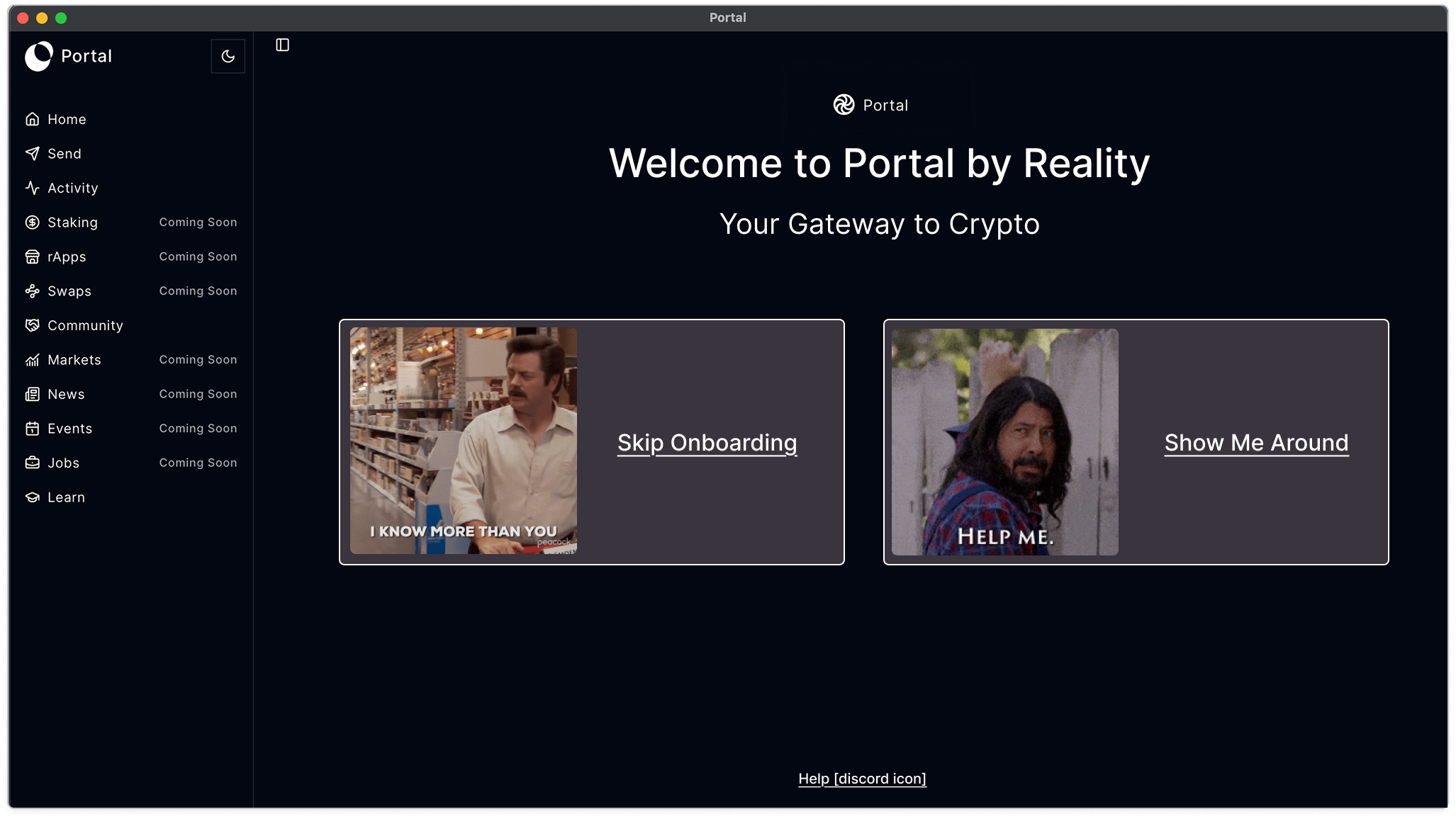
The first screen makes the split obvious. Advanced users skip straight to connecting, and first-time users select a guided tour. The memes were deliberate. Crypto audiences respond to that kind of self-awareness, and the humor helps alleviate the complexity of what comes next.
The Guided Flow
The guided flow was built on progressive disclosure. Each screen introduced a single concept, anchored it to a specific location in the interface, and used plain language rather than technical terminology.
The step counter gave users a sense of scope, so the flow never felt open-ended. The skip option was persistent, so the power user who accidentally entered the guided path could exit at any point without penalty.
The Drop-Off Risk
Of all the steps of the onboarding flow, port forwarding has the highest drop-off risk. It is a technically complex requirement that most consumer products would never ask of a user, and it arrives at the exact moment someone is deciding whether or not to trust the product with their device.
The screen broke the task into three sequential steps, addressed the IP address confusion proactively in a tip column rather than waiting for users to get stuck, and provided a direct Discord support path for anyone who needed help. The note column handled the edge case of automatic IP detection failing without burying it in an error state later in the flow.
The screen the users were seeing before the upgrade reduced this entire screen to a single icon and one sentence.
The gap between the two is the most concrete illustration of what the design was trying to do and why fidelity in execution matters.
Final Thoughts
The foundations held. The site has been rebuilt since handoff, and the structure, hierarchy, and system I put in place are still visible in what's there today. The content architecture, the navigation, the visual language, and the core messaging. All of it carried through.
I handed off a complete design system with 315 color variables, 49 typography variables, a full component library, documented token architecture, a shipped landing page, and two fully designed and shipped Portal onboarding flows.
It was a strong foundation to leave behind for a product that was going to scale fast.