Sprinkles Cupcakes:
Auto-Retail Custom Tablet Experience
Sprinkles had cupcake ATMs in airports and malls across the U.S. The machines worked. The experience didn't.
The default touchscreen UI that came with the hardware was generic, hard to navigate, and had nothing to do with the Sprinkles brand. They wanted something that felt like them, playful, premium, and easy to use in a busy environment where someone has about 60 seconds to decide, order, and pay. This was also the first time Prepango had built a fully custom vending UI for a brand partner.
What we built here became the model for every brand that came after it.

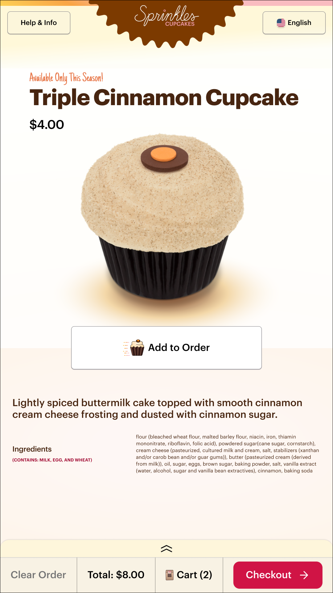
THE MACHINE

UI AFTERUI BEFORETHE PROBLEMThe machine worked. The overall experience did not. From the customer side, the ordering flow was slow and confusing because the hierarchy was unclear, hesitation occurred at key decision points, and no real brand presence. From the business side, Prepango had no scalable UI system, no reusable components for developers, and an experience that did nothing to reflect Sprinkles' premium identity. Two problems needed to be solved: fix what customers were seeing, and design a foundation the company could build on.
MY ROLELead Designer and Product Manager. I owned the full process from research to launch, managing a cross-functional team of two IT leads in San Diego and two developers in Mexico through agile sprints, while working directly with Sprinkles' marketing and operations teams on the brand side.
MY APPROACHBefore touching Figma I went on site. A field technician walked me through the machine from both sides: the customer ordering experience and the restocking process. That visit shaped everything. I saw firsthand how the interface confused customers at key decision points and how technicians worked around the system rather than with it.
From there I mapped user flows across every interaction, audited the Sprinkles brand across their site, packaging and media coverage, and identified where the current machine experience was losing people.
Designing within the technical constraints of Magex hardware meant every decision had to be grounded in what the software and hardware could actually do. I designed new tablet UI screens balancing UX vision with real hardware limitations, tested and deployed designs using a remote console, and ran visual QA with the dev team throughout to make sure execution matched the design.
The redesign introduced a scalable white label design system built to be replicated across future brand partners, custom animations and tailored error states, CTAs written in Sprinkles' voice like "Lift the Lid!", and small moments of delight including email capture to encourage return visits. Clean documentation and annotated flows were delivered at handoff along with a v2 roadmap proposal based on user and technician feedback.
SHADOWING THE TECHNICIAN EXPERIENCEUSER FLOWSTHE RESULTS20% faster ordering flow. 15% lift in completed purchases across updated machines. An estimated 30% reduction in development time thanks to the Figma component system. Fewer drop-offs at key decision points.
THE SCREENS


THE DESIGN SYSTEM THE BIG PICTUREThe design system built for Sprinkles didn't just solve one client's problem. It gave Prepango a scalable offering.
For the first time, a new brand partner could receive a fully custom vending experience without starting from zero. That shift changed what Prepango could sell and how fast they could deliver it. A white-label UX model that became the foundation for every brand partner that followed, including illy, LEGO, Kylie Cosmetics, and Benefit.